![]()
![]()
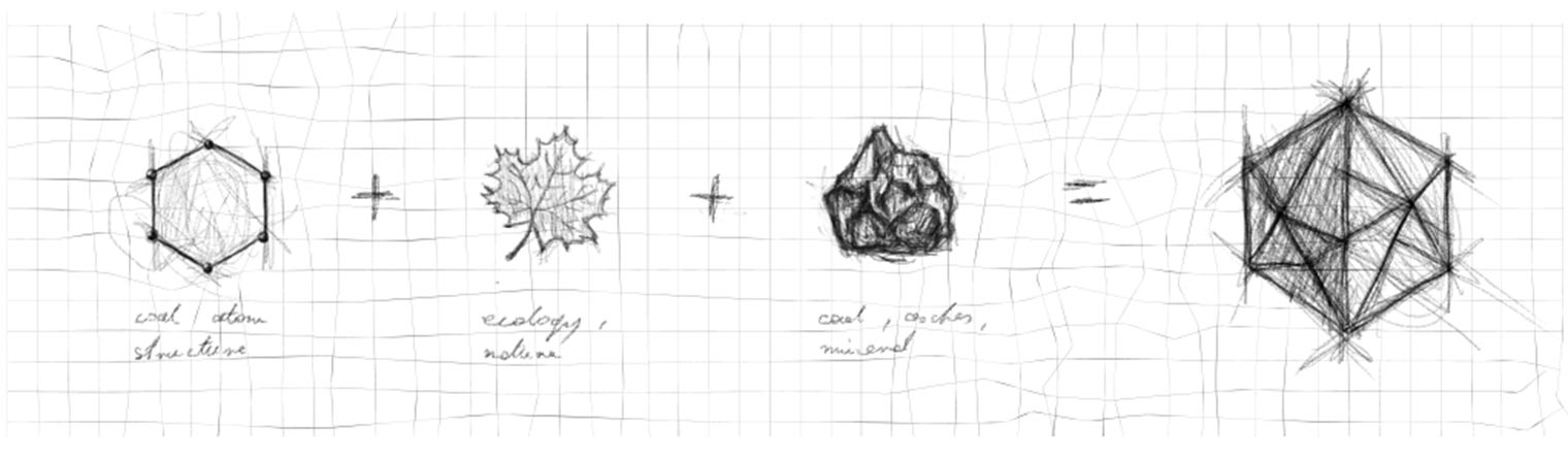
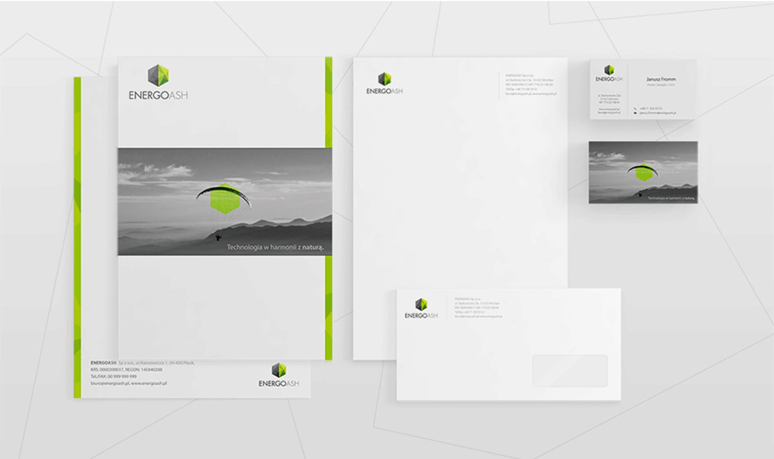
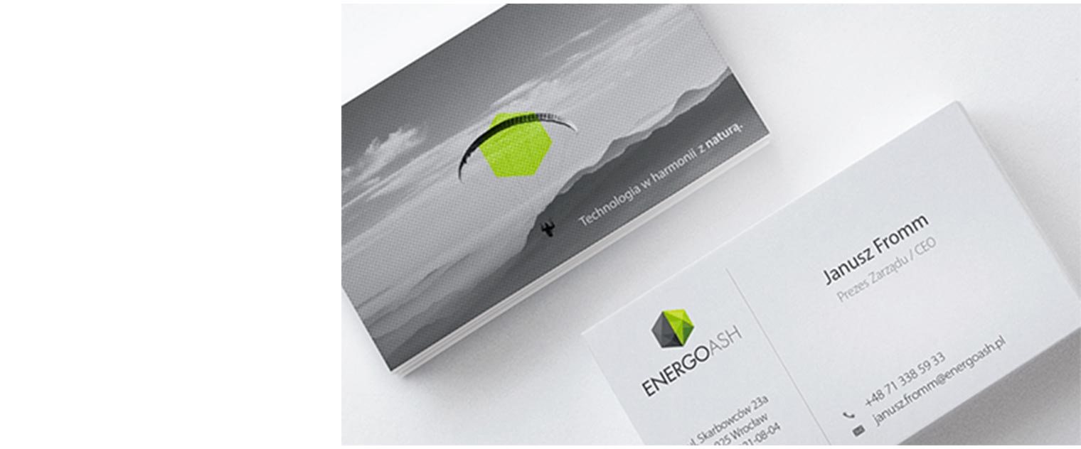
Energoash’s CEO and founder wanted to make a significant difference in the coal industry. The main values of his new company were to deliver ecological, effective and high-tech solutions. That’s why Energoash’s visual identity had to show the fresh air he wanted to bring into the grey world of mining and coal. To connect these values, their symbol should represent the main company areas: coal ash recycling and environmentally friendly technologies. Against the backdrop of their competitors, the visual identity had to emphasize that EnergoAsh is not just another company in the coal industry – they look further and makes things different.
Below you will find how many inspirations have influenced the logo idea and the whole visual identity. Energoash’s CI had to be minimalistic and hi-tech looking. But at the same time, they wanted to show their philosophy and values. Therefore simple shapes and green details were combined with meaningful pictures (not directly connected to the coal industry). Energoash’s CEO wanted to use as a main picture a paraglider flying over the mountains – a symbol of someone free, looking forward and friendly to nature. On every grey picture appears the green version of the logo to show and underline the strong connection of the brand to ecology.