![]()
![]()
Tarczyński is the most recognizable brand in Poland’s meat processing industry. Their previous business model was based only on a retail environment. Due to company development, new opportunities have arisen and Tarczynski needed fresh branding for totally new area – HoReCa. New target group was already supported by competitors but none of them put enough attention to the branding and communication with traders. All of them focused mostly on pricing. The objective was very clear – to build a brand that will be different, memorable and will engage the target group in more attractive way. Traders mostly make shopping decisions based on suppliers’ catalogues, that is why I’ve selected this medium as the most important one. The focus was in particular on high usability of catalogue and its unique design.
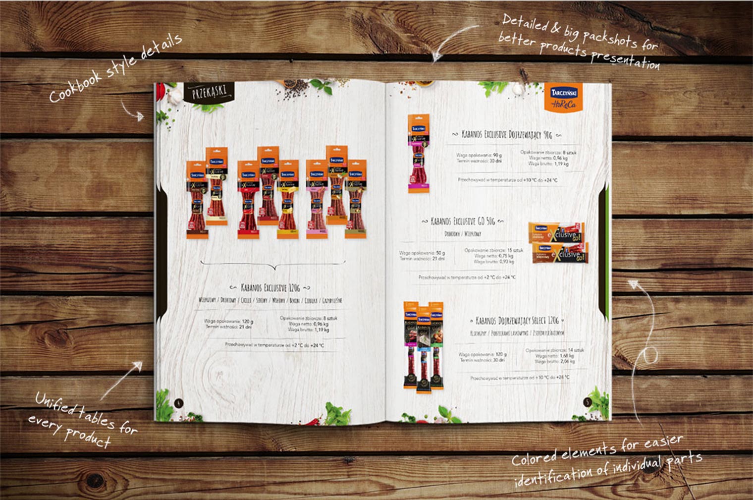
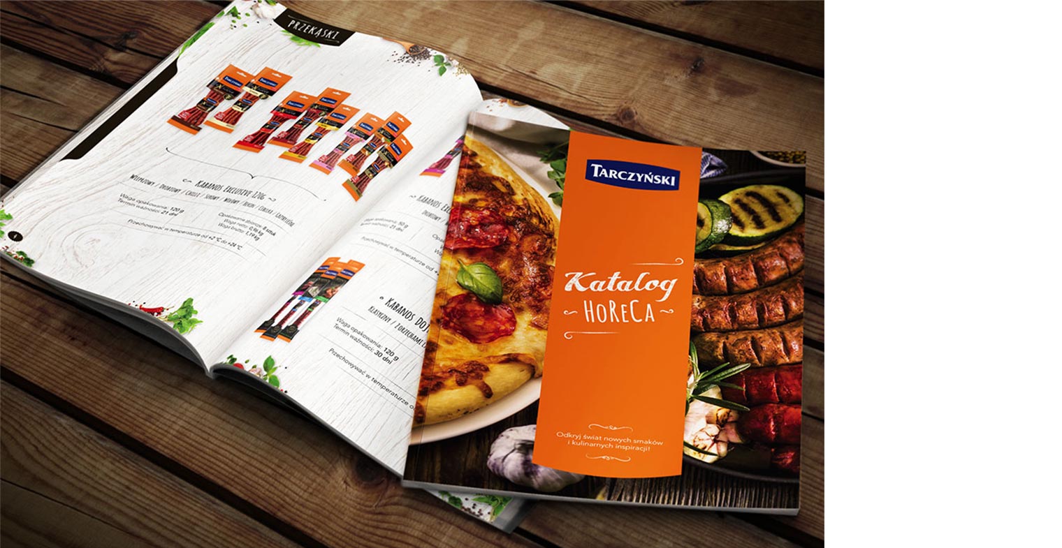
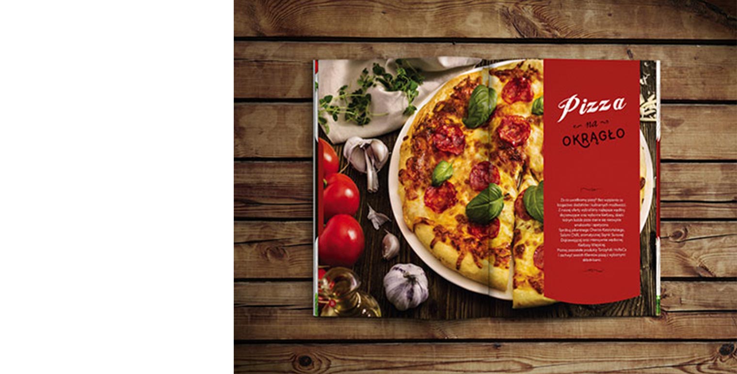
In general competitors’ catalogues include a lot of technical specification, with poor design and bunch of not really useful information or details.. I’ve decided to design key visuals according to the new trends in gastronomy and make this catalogue to look like a cookbook. All big, detailed pack shots of the products are presented on white wood for better exposure. Vegetables and spices around them helped to make the layout look much more „tasty” and added bit of freshness. Every single chapter begins with a big photo of Tarczyński’s products used in a meal, which represents certain group of products. Handwritten fonts, tables and drawn details make the whole design more stylish and gives an individual character. All those things combined together create an expression, that the products will look on the table (in a hotel or in a restaurant) as good, as in the catalogue. All information are easy to find – for better usability I used colour codes for every single part of the catalogue and unified, reduced information in tables for all products.