![]()
![]()
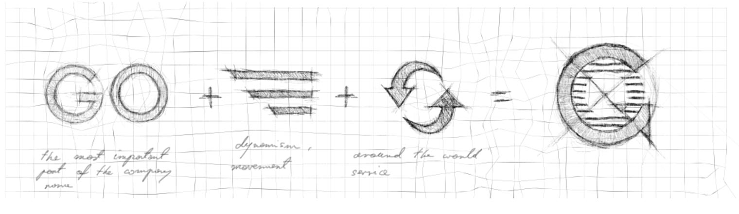
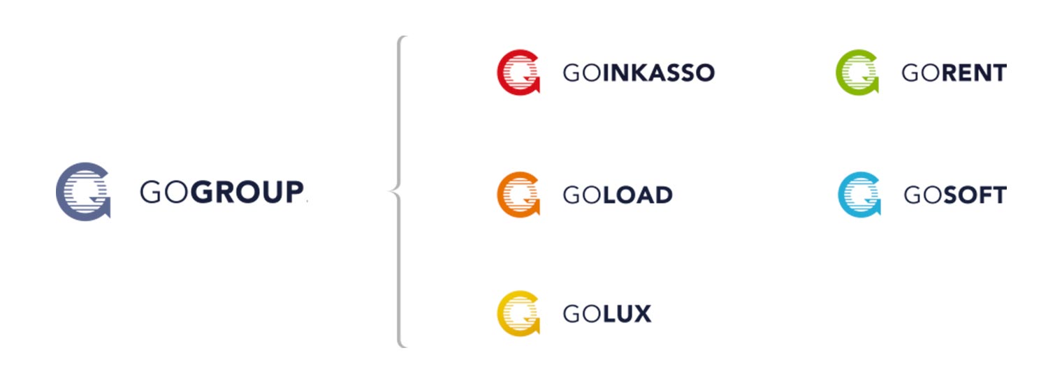
GoGroup is a holding company providing a wide spectrum of logistic services. The main objective was to create an identity which will put all the pieces together with a style and consistent philosophy. Every individual company from GoGroup has to be visually associated with the holding but at the same time, it has to keep his own character. The symbol was the most important thing because it will be used in many different ways: from an app icon for GoSoft, through 3D printed signs on walls in offices, to GoLoad logo on truck’s trailers. The main values/pillars of GoGroup holding, which should be reflected in the visual identity, are: all around solutions for logistics, comprehensiveness, dynamism, worldwide support and modernity.
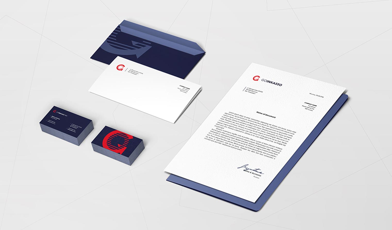
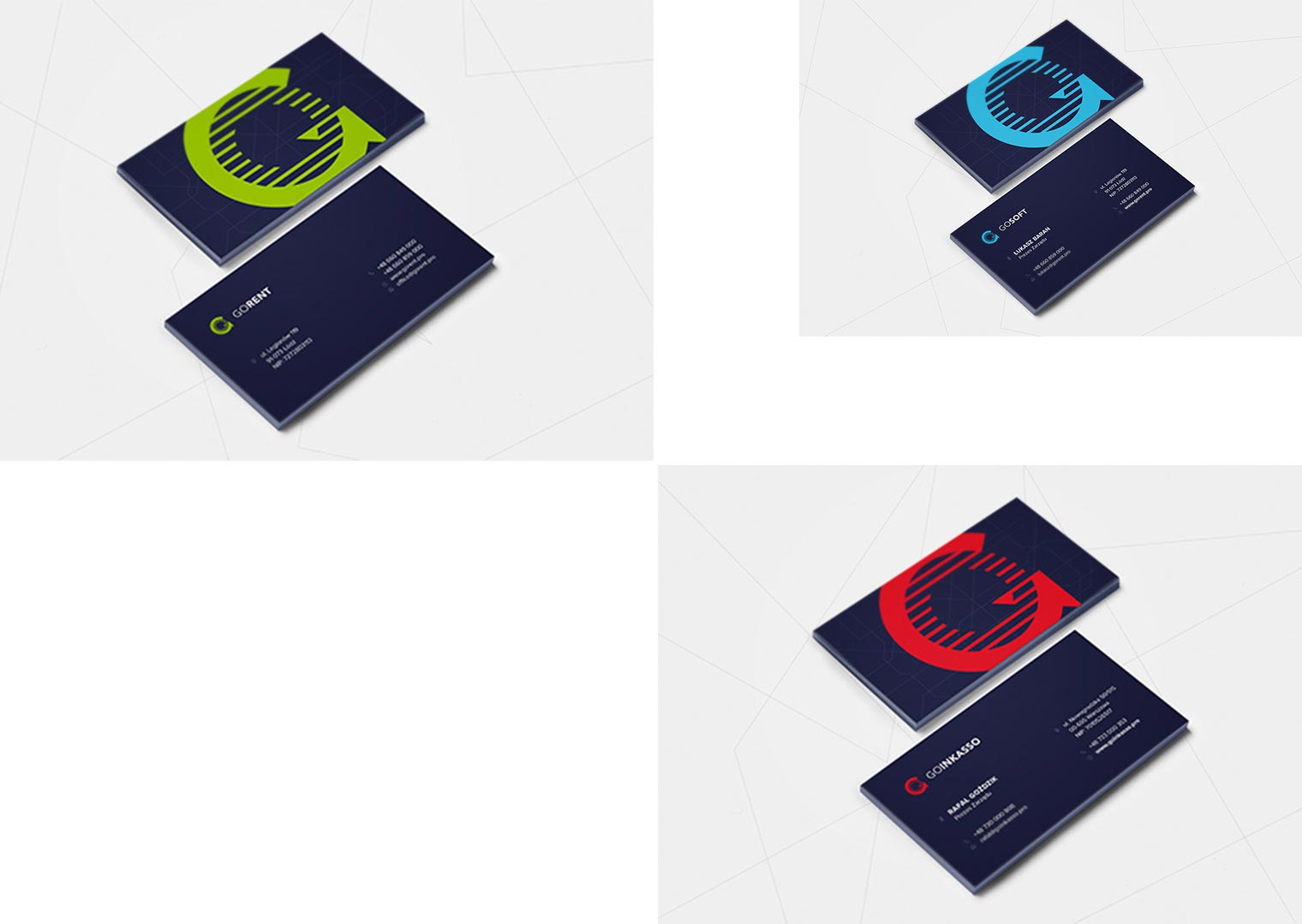
The design for GoGroup was about balance between two things: great usability and memorable look. Inspirations and shapes used to create the „GO „symbol are shown below. It has to be closed in a circle, because this form gives the best opportunity to fit on different media with all kinds of sizes (from extreme vertical to horizontal). An arrow combined with a circle is a metaphor not only for a „G” letter, but stands for movement and worldwide services. It also corresponds very strong with the logistic industry. The stripped „O” letter, inside the symbol, shows dynamism and modernity. To differ individual companies from one another I used colour code (used for a symbol and details). The main colour for GoGroup is navy blue, which is universal and match with different symbols’ colours. Key visual is based on a European map of road transport and it is represented by lines crossing each other.