Sensly
Brand strategy & visual identity
Project overview
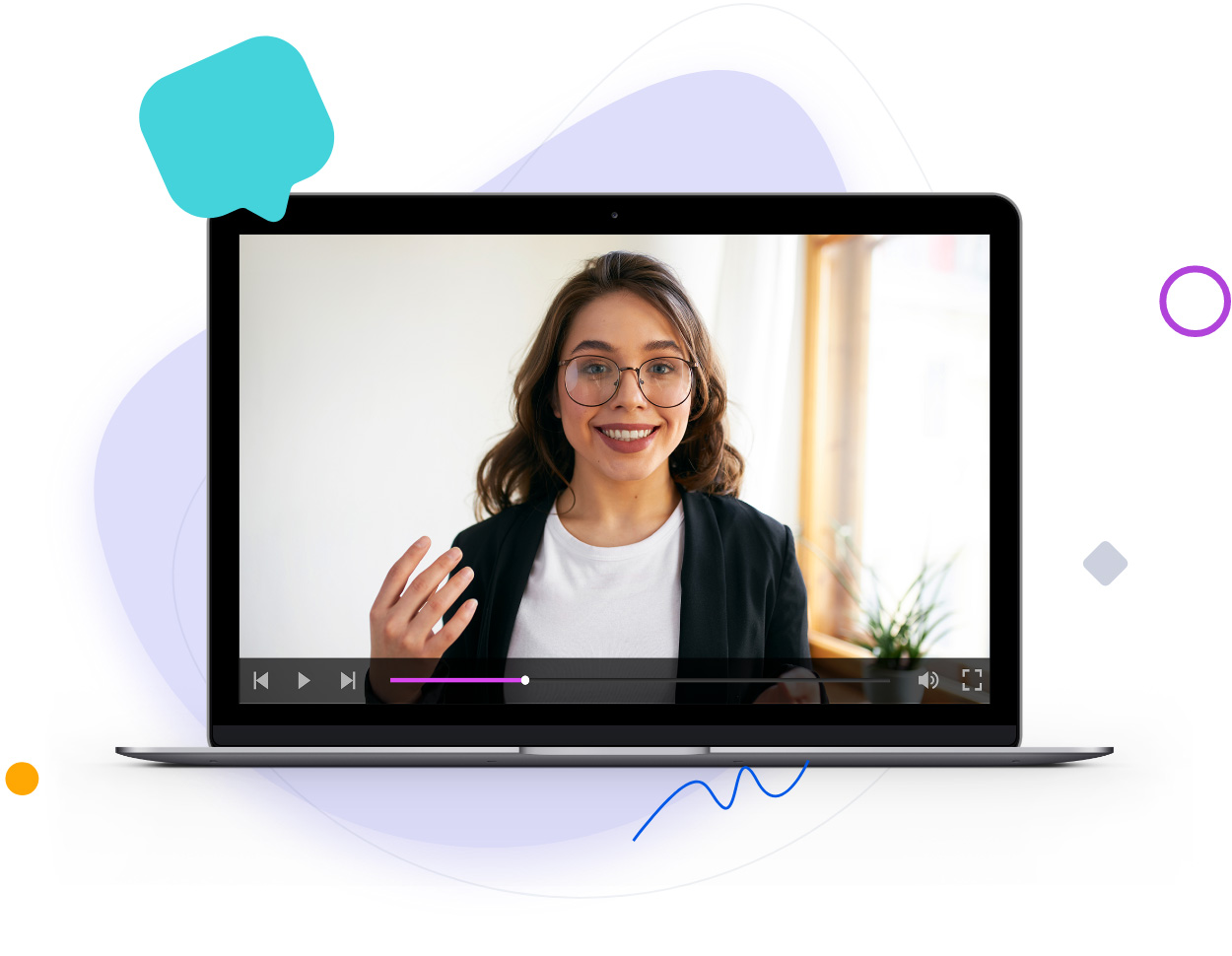
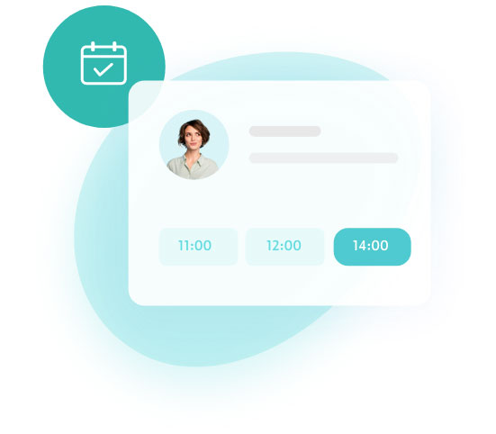
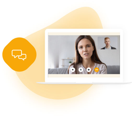
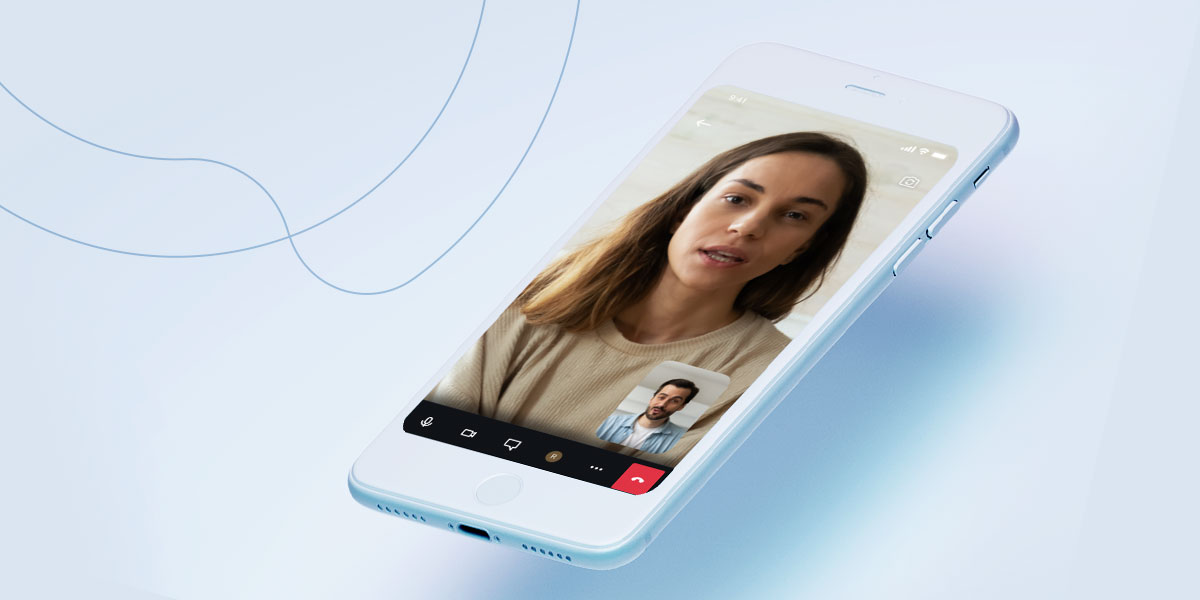
Sensly provides holistic solutions for the mental health care system. Through the marketplace, patients can find, book, and participate in online sessions with verified mental health professionals. To lower the barrier of entry, we have developed a special automated system called „Sensly Assistant.” This feature helps match patients’ problems and needs with qualified mental health professionals in their respective fields.
Additionally, Sensly offers a built-in SaaS dedicated to mental health professionals, automating their work processes and providing comprehensive support for all online services.
Goals
- Conduct market research and perform a company audit.
- Clearly define key brand elements such as USP, ESP, target audiences, and vision.
- Clearly define messaging and positioning.
- Create brand and marketing strategies.
- Create and develop brand assets and guidelines, including visual identity and tone of voice.
- Test assumptions and validate created assets.
Responsibilities
- Leading the project by combining Agile Branding Strategy with Design Thinking
- Conducting various workshops
- Creating, measuring, and iterating the brand strategy
- Leading the hands-on creation of a comprehensive visual identity
- Leading the creation of a content strategy with a strong focus on UX copy
- Collaborating with analysts to build and improve data collection methods (Google Analytics, HotJar, Kibana)
Branding process
with agile approach
Step 1
Brand discovery
A deep dive into the business to understand its context and learn about users’ needs and motivations.
Key activities
- Audit of existing materials and documents
- Market research
- Competitor analysis
- Interviews with potential customers
- 1:1 meetings with all employees
- Workshops
Step 2
Brand strategy
Defining fundamentals of the brand’s world: from company’s vision to brand’s desired position.
Defined elements
- Key products and services
- Key target audiences and their needs/problems
- Key competitors and competitive advantage (USP + ESP)
- Company’s attributes and values
- Mission and vision
- The tone of voice, messaging and positioning
- Brand personality and story
Step 3
Brand design
Creating visual representation of the brand’s world that resonates with the audience.
Key responsibilities
- Creating a new logo
- Developing brand identity and guidelines
- Choosing imagery and photography direction
- Creating a design system
- Designing the marketplace and SaaS
Step 4
Brand activation
Executing brand strategy across multiple brand touch points in a consistent manner.
Main areas
- Performance marketing
- Social media marketing
- Pitch deck / presentations
Vision
Providing professional support to anyone who wants to take care of their mental health.
Mission
Supporting mental health professionals and centers in providing holistic and effective care for their patients.
Brand strategy
selected elements
Sensly’s story was about normalising the practice of caring for mental health and empowering individuals to find their own ways to do so. Through various campaigns, marketing activities, blog posts, testimonials, and even product UX and solutions, we strived to create a supportive brand experience. Our goal was to assist people in their personal growth, facilitating change and providing greater comfort in their lives.
We developed friendly and easy-to-understand communication around challenging and emotional topics emphasizing understanding and inclusivity. We intended to alleviate the fear of judgment often associated with seeking help and feeling of not being understood by others.
We strongly advocated for and guided how to build and strengthen healthy relationships, or even how to take care of one’s diet, in order to be as helpful as possible. Why? To be like that sincere friend who is always there to support you without imposing advice on how to live your life… and that’s why you trust their judgement.
However, achieving this went beyond simply declaring it as the company’s purpose. The core factor that made it possible was the people and Sensly team’s culture.
For both audiences (B2C & B2B), the messaging has been personalized. We have crafted specific messages tailored to the needs, emotions, and aspirations of our selected target audiences. Through rigorous testing, we have evaluated our Unique Selling Points (USPs) and Emotional Selling Points (ESPs) against different assumptions to identify the best fit for our target audience.
The tone of voice reflected the main values, such as openness, understanding, and care. We aimed to communicate with a relatable tone, without patronisation or clichés. As a result, we have achieved something different from what most statistics suggest: despite the fact that men are typically three times less likely to seek mental health care, nearly 50% of our customers are men. While multiple factors contribute to this, our messaging has played a significant role in attracting and engaging this audience.
B2C
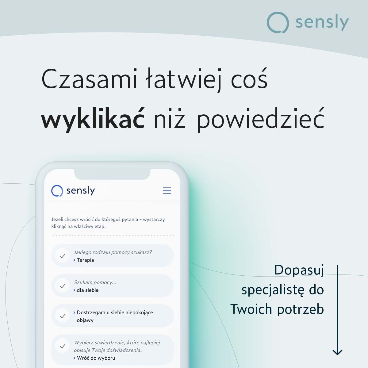
To define target audiences I began by creating a personas matrix that included demographic, geographic, and psychographic data. In the next stage I invited to collaboration three mental health professionals and together we enriched the classic personas matrix by incorporating additional psychological dimensions. This included factors such as identity crises specific to certain age groups, prevalent addictions, typical mental health issues based on specific backgrounds and more. Each group was then evaluated based on size, accessibility, and their openness to using our services. This assessment helped us prioritise the target audiences for testing.
B2B
The personas matrix developed for mental health professionals was created using the JTBD (Jobs to Be Done) framework. This matrix was then enhanced with demographic, geographic, and psychographic data. Similar to the B2C audiences, the B2B target audiences were selected using a scoring method.
Both matrices (B2C & B2B) were further enhanced by incorporating unique selling propositions (USPs) and emotional selling propositions (ESPs) that reflected the brand’s relevance within the scoring method.
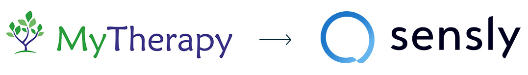
To create a new company name, I utilised mind mapping, in-depth competitor analysis, brainstorming, and name testing on random user groups. The new name had to sound good and be easily pronounceable for both foreigners and the Polish market, where the company was starting.
Each idea was also validated for URL availability and trademarks. The name „Sensly” was built based on the word „sens,” which means „meaning/sense/purpose” in Polish, English (sense), and French (sens). All these words align with the world of mental health and personal development. Therapeutic work is often referred to as the „search for meaning” as well.
One of the significant conclusions we reached with the team during the „Brand discovery” workshop was the decision to change the company’s former name, „MyTherapy.” The task was relatively easier as the product was not yet publicly available.
One of the main reasons for the change was the realisation that Sensly would offer much more than just therapy services, as implied by the name „MyTherapy.” Additionally, startups evolve rapidly, and names that restrict business expansion or pivots do not withstand the test of time
Brand design
key elements
Goals
- Reflect Sensly’s values in a compelling way for different target audiences.
- Build a world of comfort, safety, and calmness with a positive outlook on the future.
- Cover both literal and metaphorical levels of communication.
- Enable high scalability and efficiency of marketing assets.
- Leave enough room for further horizontal business development while ensuring the consistency of all materials.
Logo design
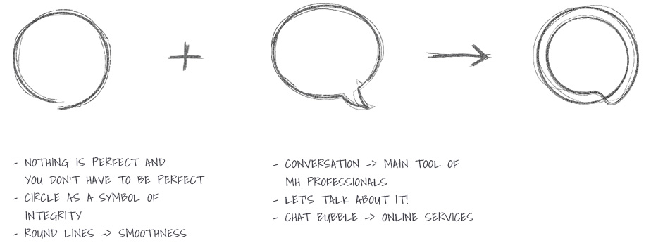
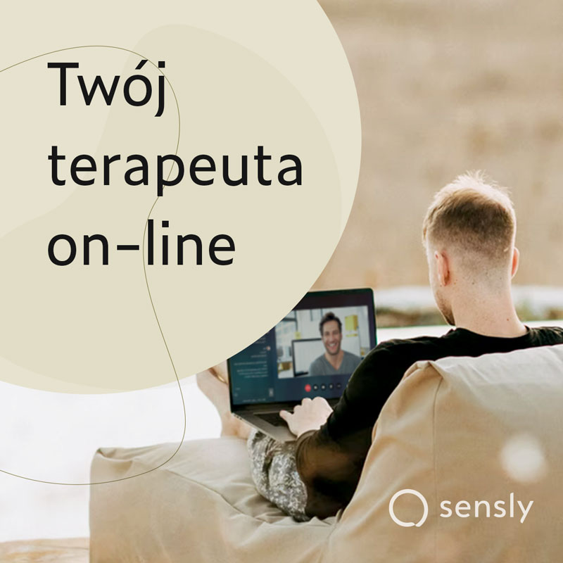
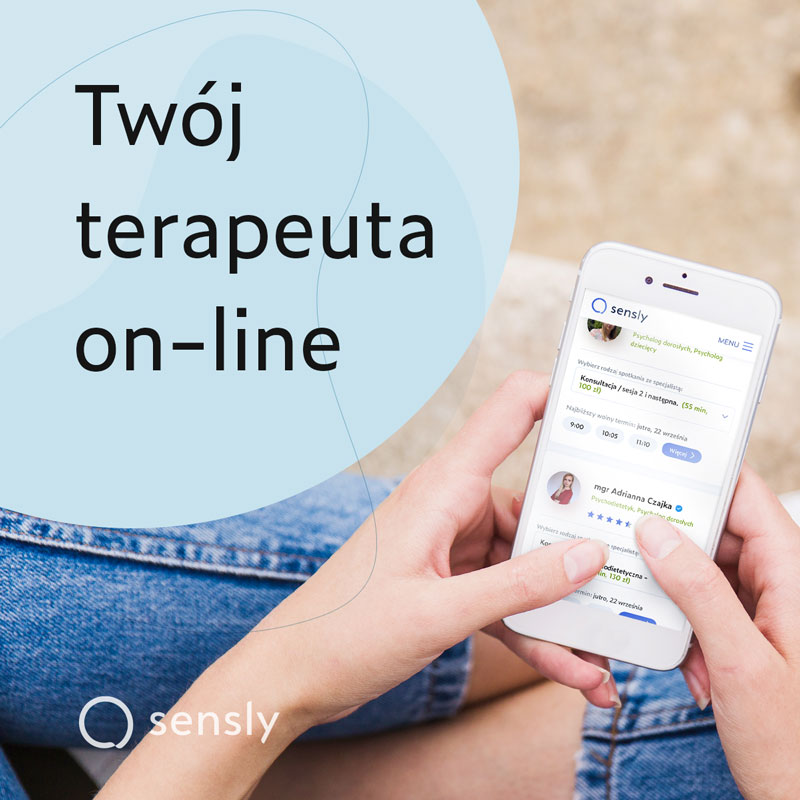
The logo I have created is a combination of two metaphors: conversation and the beauty of imperfection. The symbol is based on an „imperfect circle,” which in the realm of mental health is a metaphor for the idea that imperfection is normal and healthy.
Enclosed within the circle is a delicate chat bubble, symbolising conversation—the primary tool used by mental health professionals when working with patients – and also representing digital nature of available services.
The company name is written in lowercase to create a sense of approachability, and the custom-designed font emphasises the gentle and calm character of the brand in its curves.
Fonts
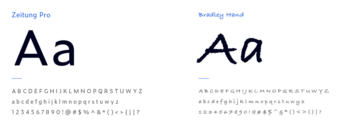
„Zeitung” – the chosen primary font due to its high legibility, modern character, well-balanced proportions, and ample white space within the characters. One of the main criteria for selection was also the coverage of all alphabetic characters in different languages (future localisation), along with humanist features such as width variations.
„Bradley Hand” – a supporting font used in certain channels like Instagram or blogs. It adds a „human touch” and a more personalised character to visual communication. Contributes to more of a humane and approachable feeling of the brand.
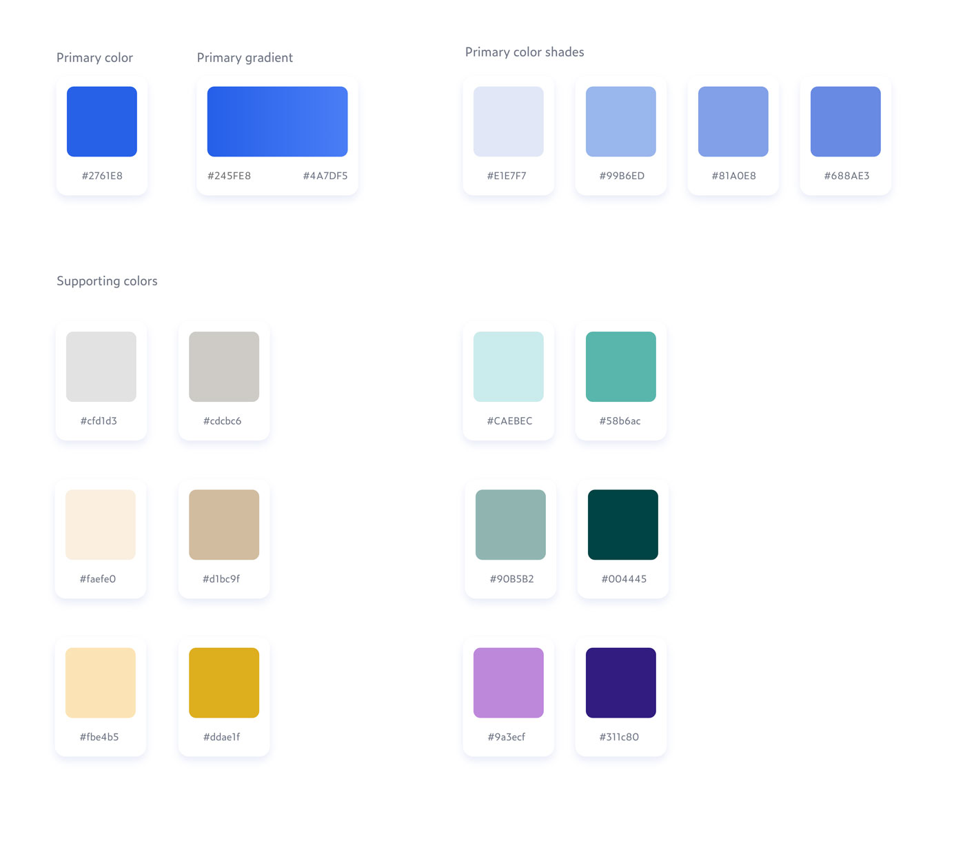
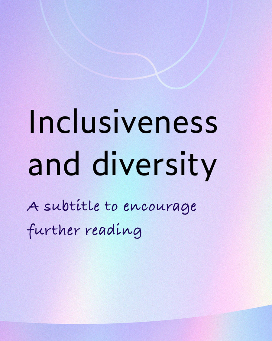
Colors
The aim of Sensly’s visual language was to create a sense of peace, openness, balance, and optimism. At the same time, when selecting the colour palette, I took many factors into account, with the most important being compliance with WCAG.
The primary colour is cobalt blue, which symbolises trust, reliability, wisdom, calmness, depth, spirituality, and serenity. Its beautiful contrast with grey and white, complemented by various shades of blue, significantly contributes to the overall brand feeling.
The supporting colours consist of a group of pastels paired with a more saturated version of the same colour for accents. These colours bring more life and dynamism to the message, support the conveyed emotions, and balance the coolness that an excess of blue colour may introduce.
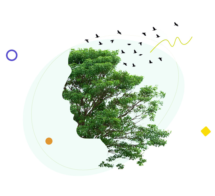
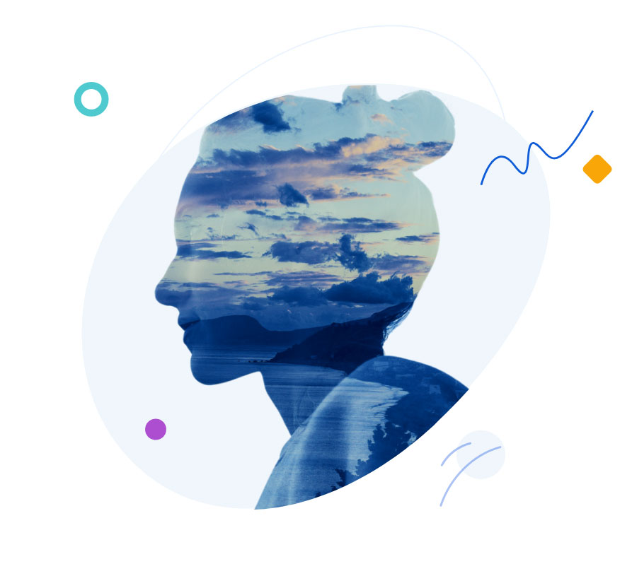
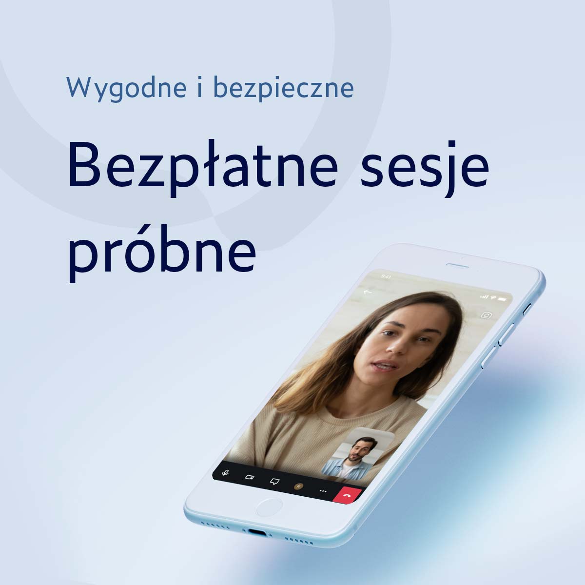
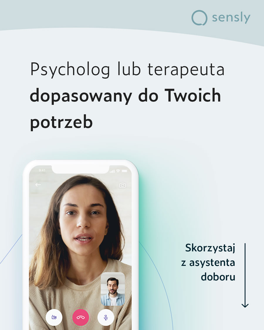
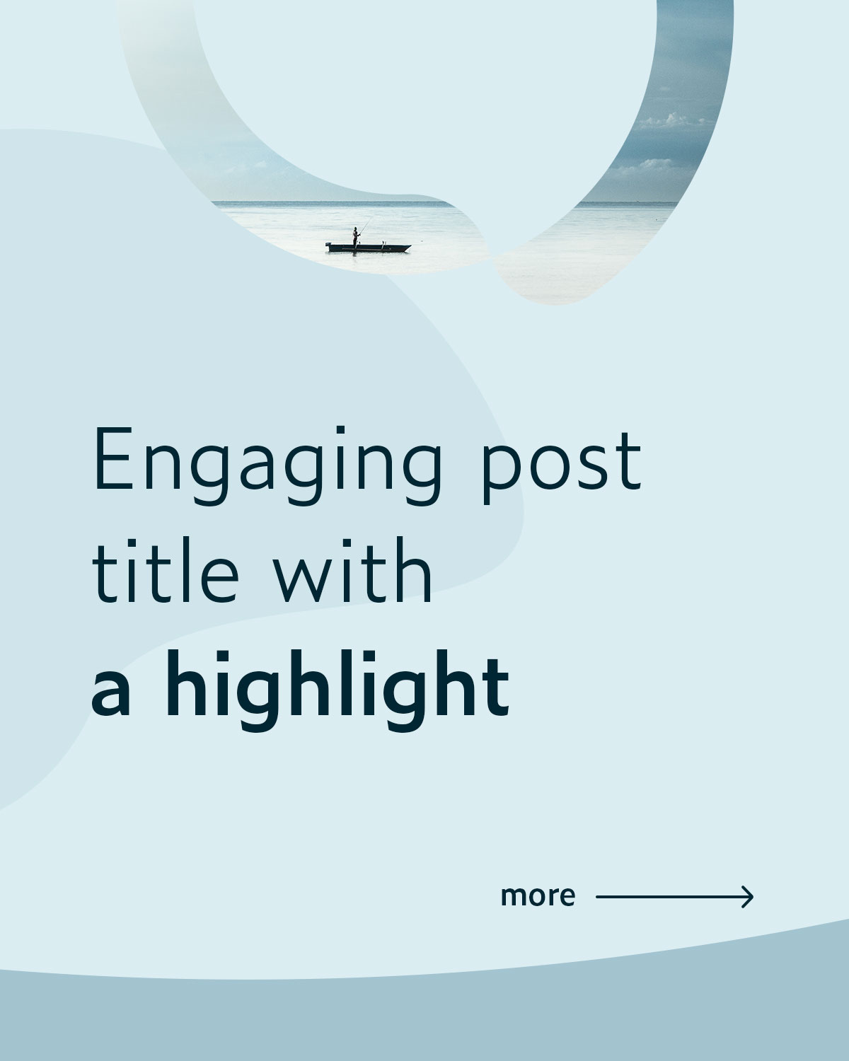
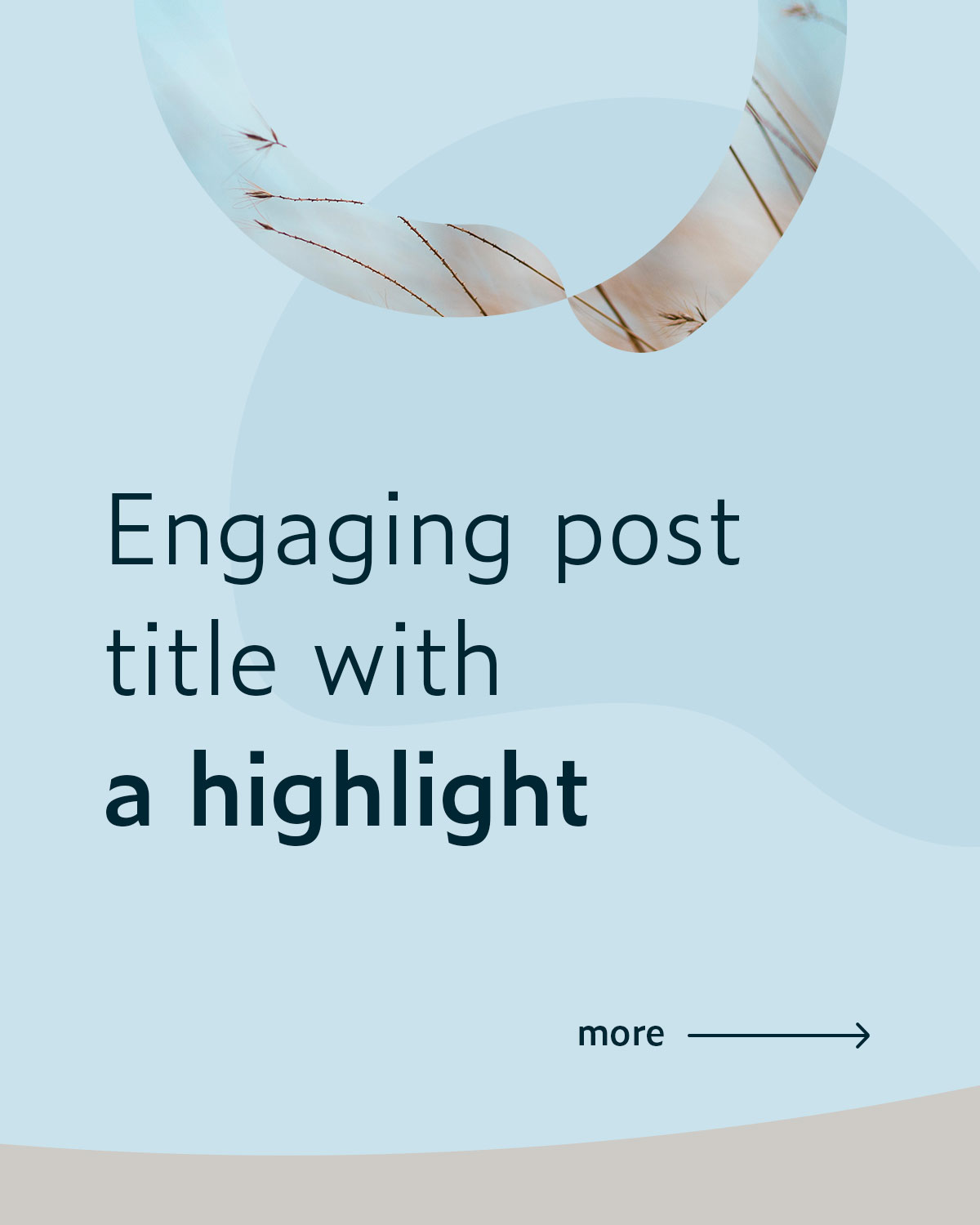
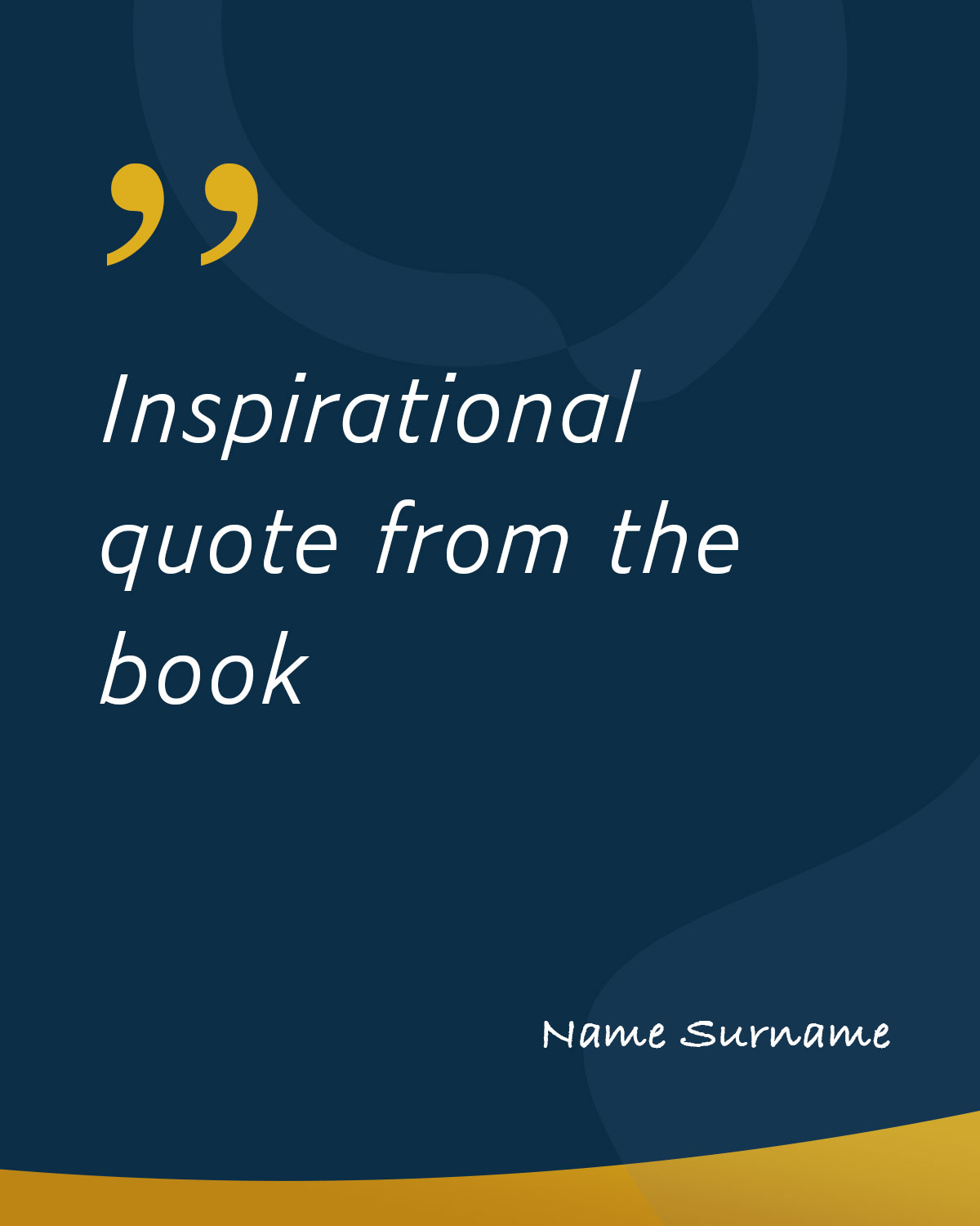
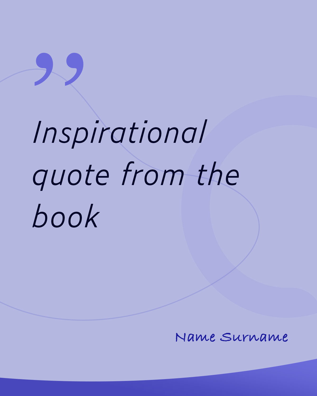
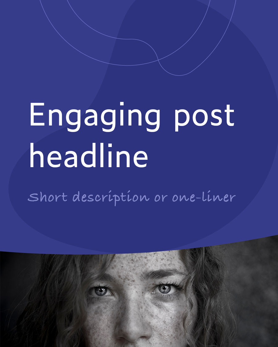
Pictures
Due to the metaphorical nature of many topics related to mental health and psychology, the main principle was to avoid literal photographs in order to prevent excessive framing and complement the visual message with appropriate content.
Of course, the colour tone of our book was consistent throughout. The photographs were divided into four categories:
- Macro shots of people’s faces, focusing on emotions
- Symbolic and unconventional shots
- Nature photos without animals, wide horizons, open frames
- Repetitive natural or artificial patterns
In the case of the last two categories, an additional factor in selecting these themes was psychological research, which indicated that these images have a calming effect on people.


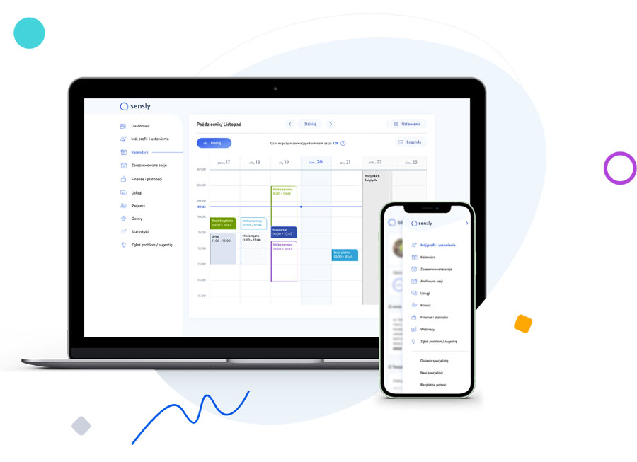
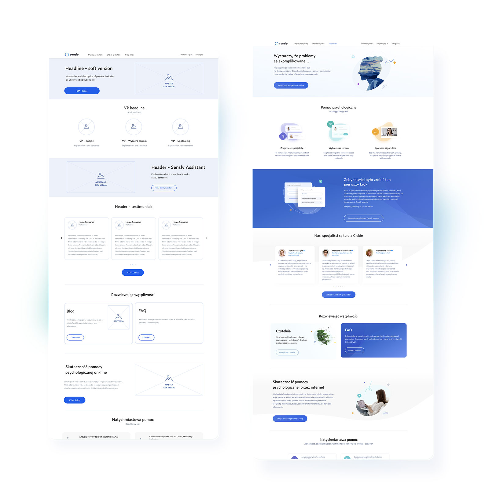
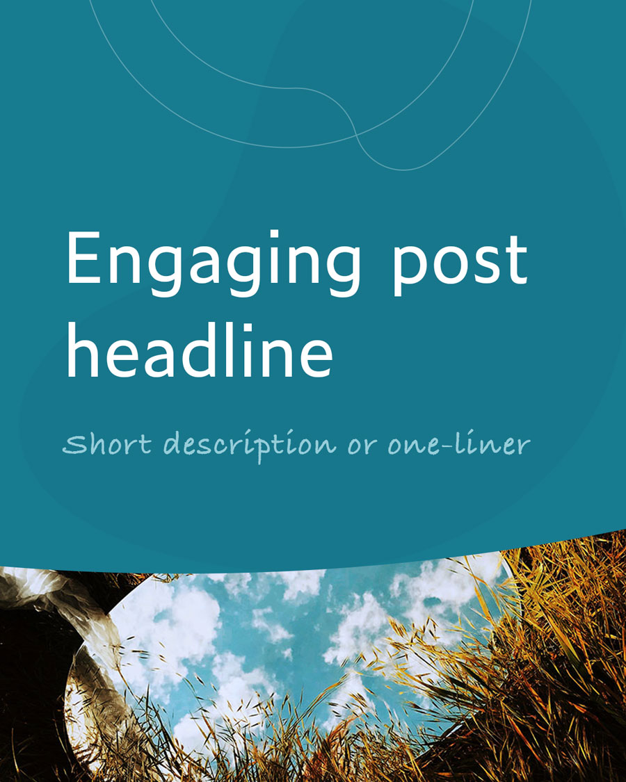
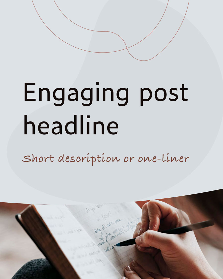
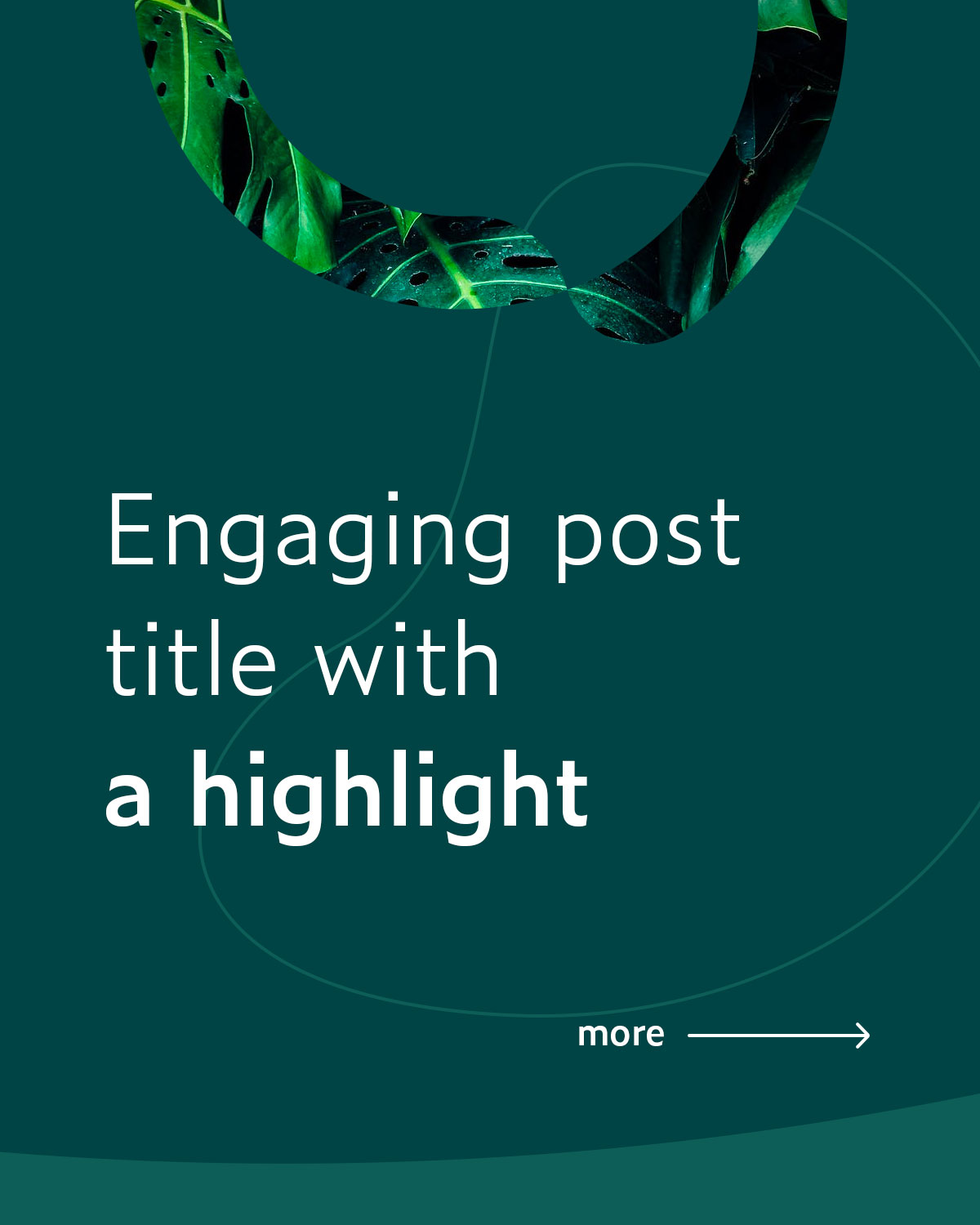
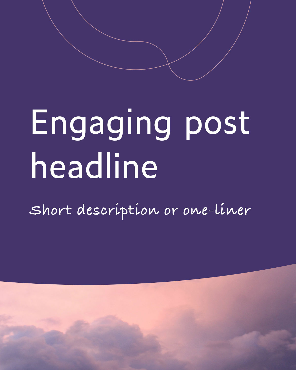
Key visual
The key visuals consisted of collages, combining illustrative icons and photographs. This approach ensured that the combination of different elements from the visual system maintained proper consistency, from the smallest „atoms” to complete visuals.
This approach also eliminated the need for dedicated illustrators in the team during the early stages of business development. It also set our visual language apart from competitors, as many relied heavily on illustrations. This unique visual language became one of our key differentiators.
The use of collages provided an opportunity to employ metaphorical language while effectively aligning it with more product-oriented communication. In B2B communication, the key visuals primarily focused on product visualisation and iconography, reflecting the professional image we were creating around our solutions dedicated to specialists (SaaS).
In B2C communication, there was greater flexibility for metaphorical representations, particularly in social media and content marketing. However, our Unique Selling Propositions (USPs) were typically supported by illustrative icons and product-based visualisations, while Emotional Selling Propositions (ESPs) were enhanced by metaphorical key visuals and photographs.
Illustrations & icons
Illustrations and icons are elements built from atoms within the visual design system, enabling better scalability and efficiency in creating new assets. This approach ensures that all visuals are consistent and harmonious with each other, as consistency originates from the core and permeates through every single element.

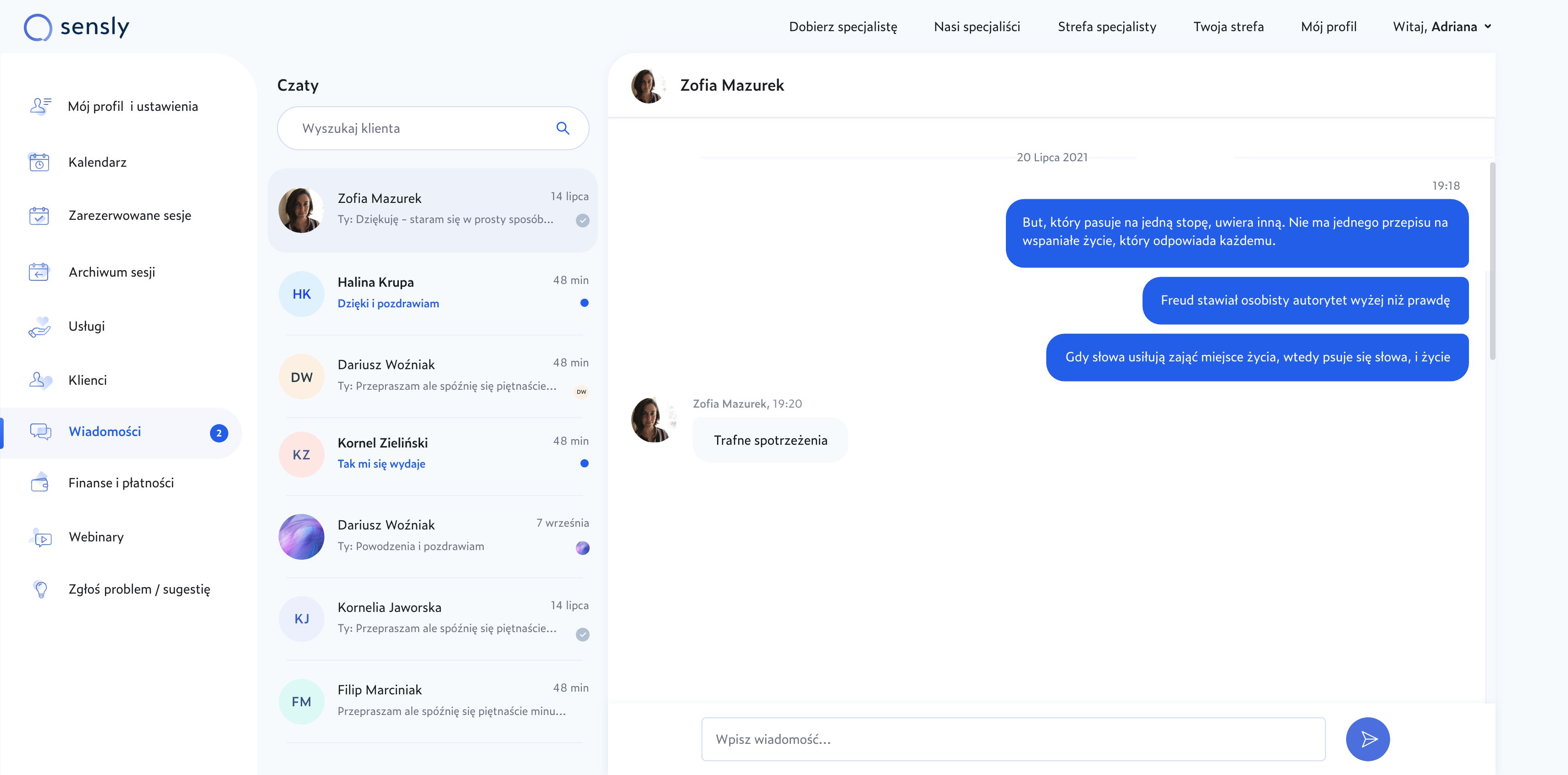
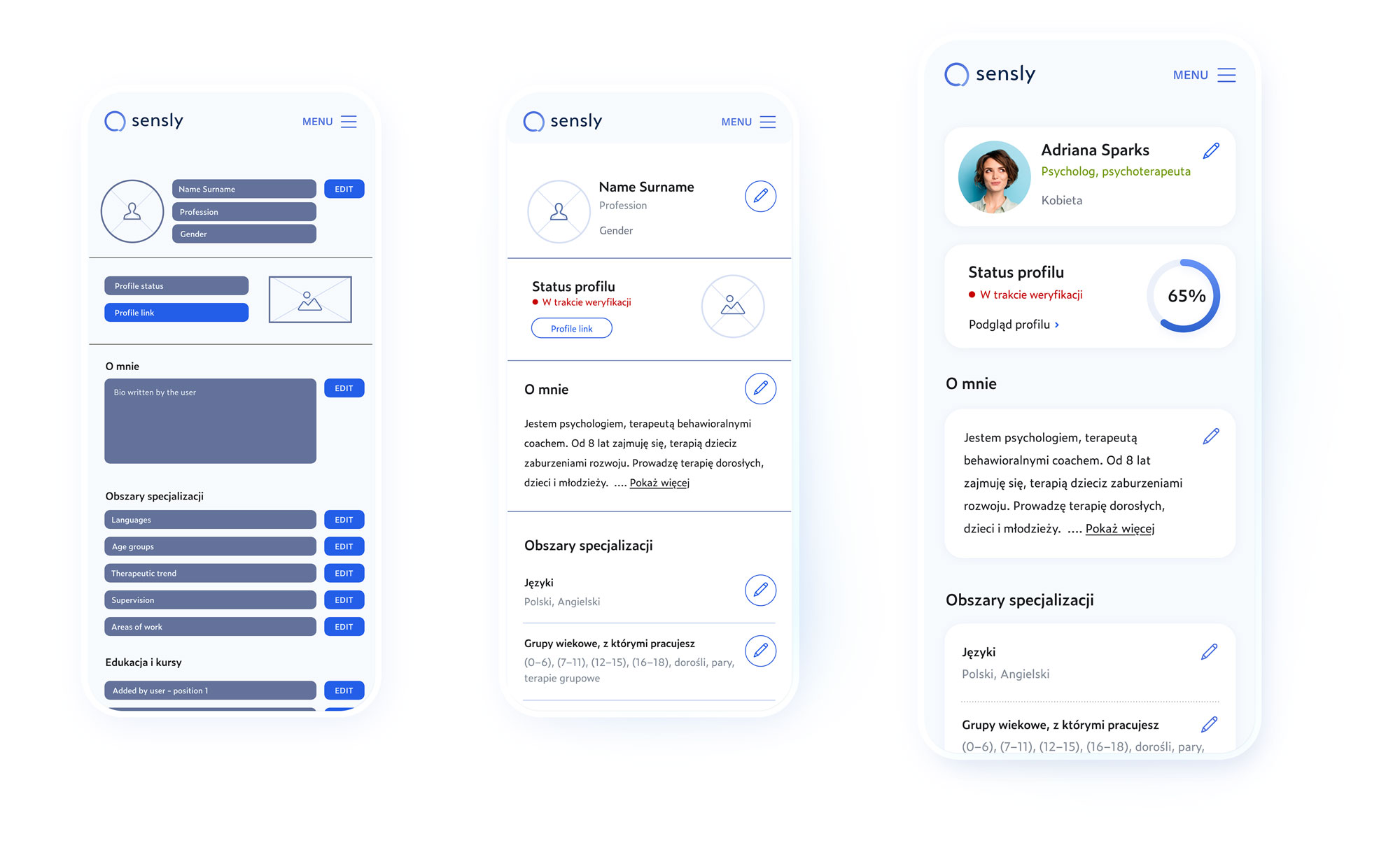
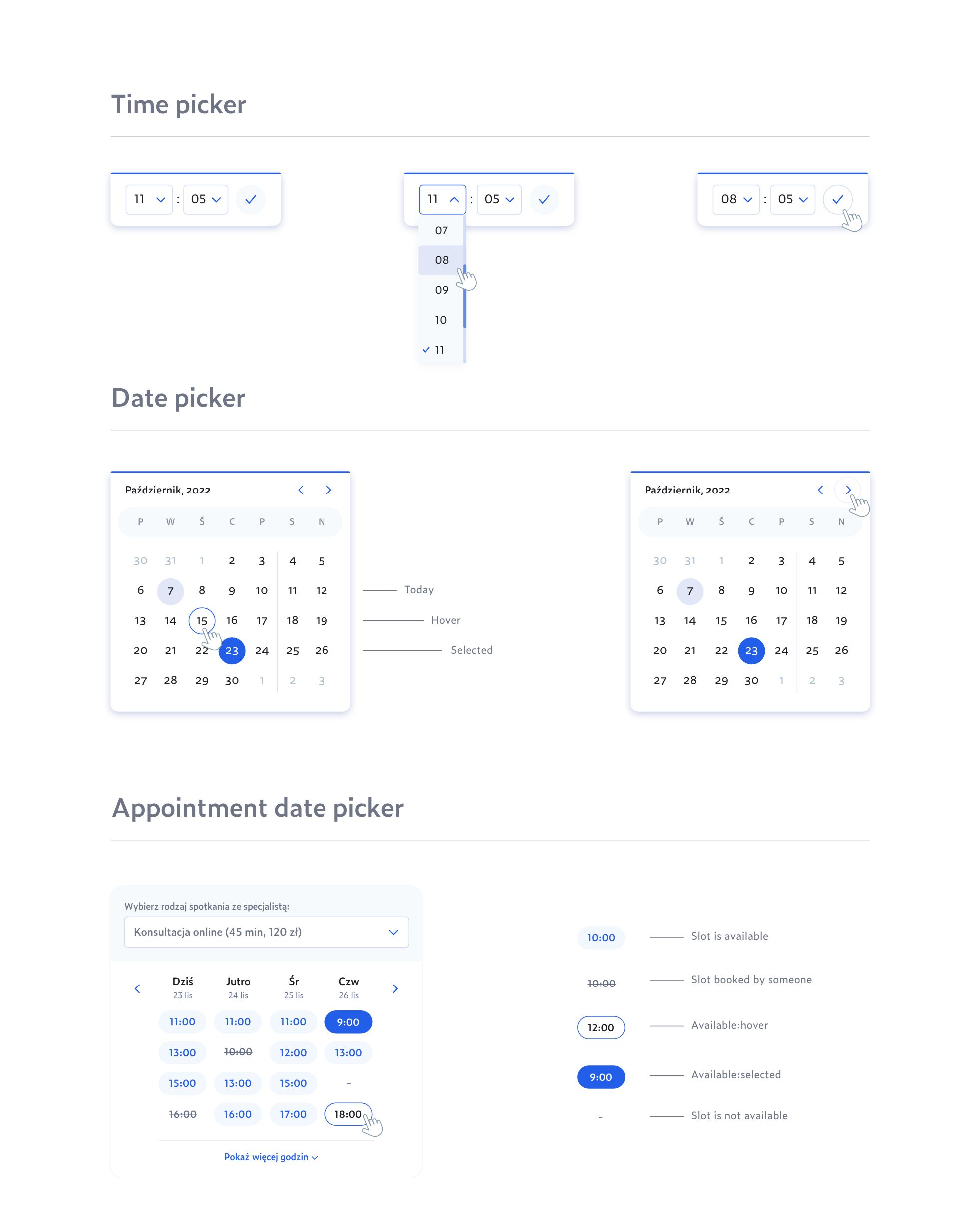
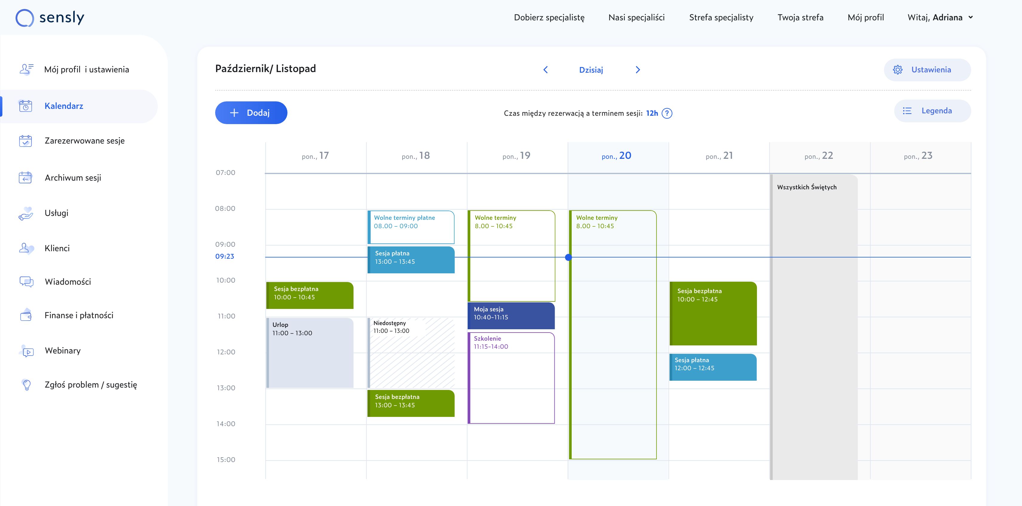
Marketplace & SaaS design
For the design of the marketplace and SaaS, I have dedicated a separate case study to present my approach in building it and ensuring its consistency with the Sensly brand.
Brand activation
scalability in storytelling
Goals
- Execute the brand strategy to establish the desired Sensly brand image.
- Test various brand assets and assumptions to iterate and improve materials and communications in the future.
- Achieve the goals outlined in the go-to-market strategy, such as performance metrics and brand awareness.
- Communicate the brand effectively to different audiences, including investors.
Performance marketing
The biggest challenge was the limitations imposed by Google and Meta policies regarding advertising mental health services. The special rules for crafting communications and the sensitivity of the topic itself made this task exceptionally demanding. However, by conducting dozens of parallel tests, we were able to develop messages that met the requirements of advertising networks, resonated with users, and still aligned with the Sensly brand.
Social media marketing
The topic of mental health in social media is heavily focused on education. Based on the developed content strategy, I have designed a visual system that ensures easy scalability and high efficiency in creating new posts. At the same time, it provides visual diversity, flexibility in terms of material usage, and easy identification of posts related to the pillars/series of our content strategy.
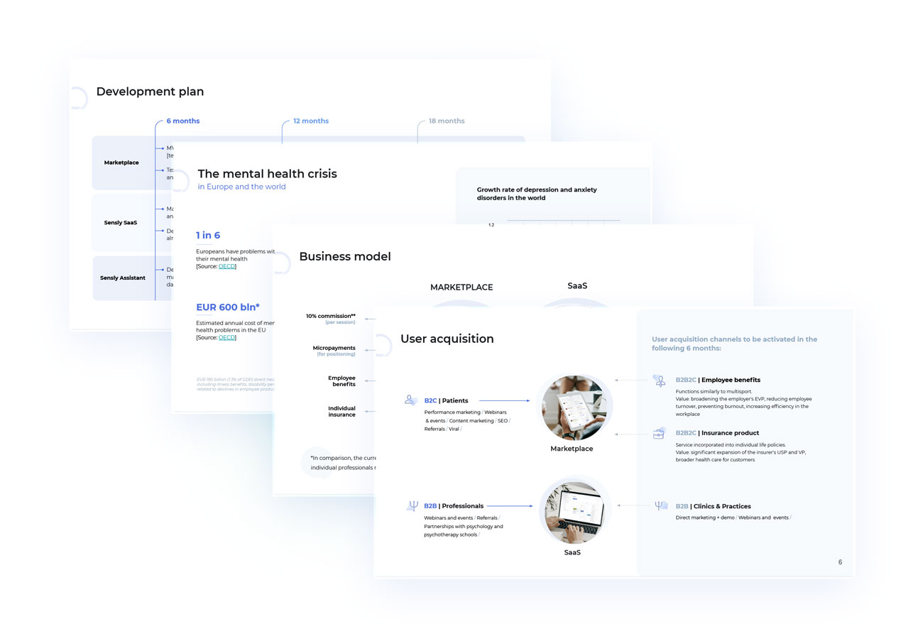
Pitch deck & presentations
Sales materials, presentations, and pitch decks are often disregarded when it comes to establishing a strong brand identity. However, Sensly took a different approach, recognising the importance of these materials. When a company embarks on its journey, it must prioritise building trust. Therefore, we dedicated special attention to crafting these materials to convey a sense of professionalism typically associated with more established entities. Our strategy was to create an impression of being larger than the company was at that time, and the results were truly rewarding.