Robin Wood
Brand strategy & visual identity
About the company
Robin Wood’s journey began in early 2016. I founded the company with the intention of creating a sustainable brand from the very core of its beliefs to its products, through to the experiences it delivered to our customers.
Robin Wood is an environmentally conscious brand, which creates handmade watches and sunglasses made from bamboo, hemp and cork. The main value proposition stems from the unique and eco-friendly materials used, the handmade production process as well as giving back to nature by sharing up to 10% of the company’s income to plant trees, support equine therapy or heal old forests.
The customers were mainly from the U.S.A. (62%), France (5%), Germany (8%), Poland (17%) and the rest from all around the world.
Goals
- Creating an unforgettable and cohesive brand that resonates with people
- Developing a scalable visual identity that effectively tells the brand’s story
- Designing and crafting unique products using unconventional materials
- Balancing business operations with a strong commitment to eco-friendly initiatives
- Breaking the stereotype that eco products are exclusively for the affluent
- Educating people about the superior quality of materials like wood, cork, and hemp
- Addressing concerns of „greenwashing” and fostering trust in eco-friendly companies among our target audience
- Navigating challenges presented by anti-vegan and anti-eco movements
Responsibilities
- Conducted in-depth market research
- Developed a detailed brand strategy, including the mission, vision, values, personas matrix, competition analysis, brand story, messaging and positioning, unique selling points, and emotional selling points.
- Created and executed a comprehensive marketing strategy to drive brand growth and engagement
- Led the design and implementation of a cohesive brand identity
- Defined and maintained a distinct and compelling tone of voice, messaging, and language guidelines
- Oversaw the creation, testing, and refinement of all marketing assets, ensuring alignment with brand strategy and visual identity
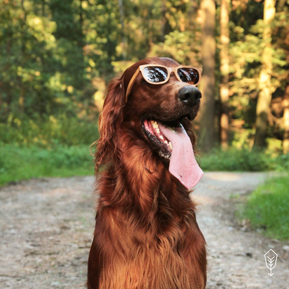
- Directed photoshoots
- Oversaw product design and development (watches, sunglasses & bikes)
- Designed an e-commerce platform with a user-centric and data-driven approach
Brand strategy
Selected elements

Storytelling
The main element of the branding strategy was storytelling, which started with the company’s name itself. It was reflected not just in all the marketing materials and customer experience but also in the overall philosophy and development of the company.
Based on market research and the personas matrix, I created a character that reflects the aspirations and core beliefs of the target audience. The name? Based on the „Legend of Robin Hood” but with a wooden twist: to add a certain level of familiarity while still being different, bring in a bit of humour, and connect it with the famous archer’s disruptive and nature-loving character.
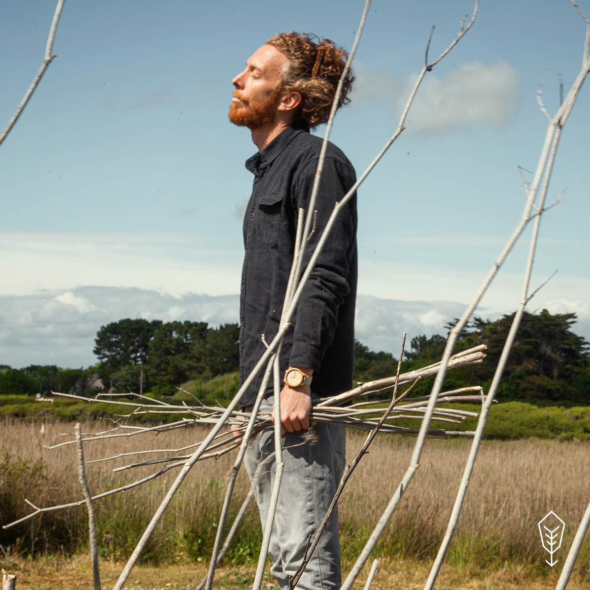
Although deliberate references to his history could be found, understanding this legend wasn’t necessary to fully grasp the brand narrative. Also, I didn’t visualize the character of Robin Wood to avoid imposing too many limitations on customers’ imaginations. The brand was all about striking a healthy balance and promoting a lifestyle centred around outdoor activities, travel, appreciating the present moment, and being amazed by nature. You didn’t have to own the product to be a part of that world. If you did, it was always a great idea to „take Robin back to the forest” and spend some time in nature.
By purchasing products, you entered ShareWood („Sherwood” in the legend) – an imaginary forest full of eco-initiatives supported by the company through sharing a portion of the proceeds from each purchase. And then there was the real forest – Robin Wood, along with the Gaja Foundation, planted over 2000 trees in Poland.

Brand's cornerstones
Values: Authenticity, naturalness, openness (towards the world, change, others), greenness, ecology, minimalism, detail-oriented, sustainability, positivity, curiosity, activism, connection/escapism to nature.
Vision: To create the finest, eco-friendly designs for people, while being an example for environmentally conscious businesses.
Mission: To create a connection between nature and people through design, materials, eco-friendly initiatives and education. Sustainability is at the heart of everything we do at Robin Wood, from responsible sourcing of materials to the positive impact we have on communities.
Claim: Love design. Feel nature. Be eco!
This claim encapsulates the essence of Robin Wood’s core values. Each element carries equal weight and aims to evoke the emotions and sensations we want people to experience when they enter Robin’s world. „Love, feel, be” represents a call to action, addressing the fundamental desires of our target audience across different aspects of their lives.

Language
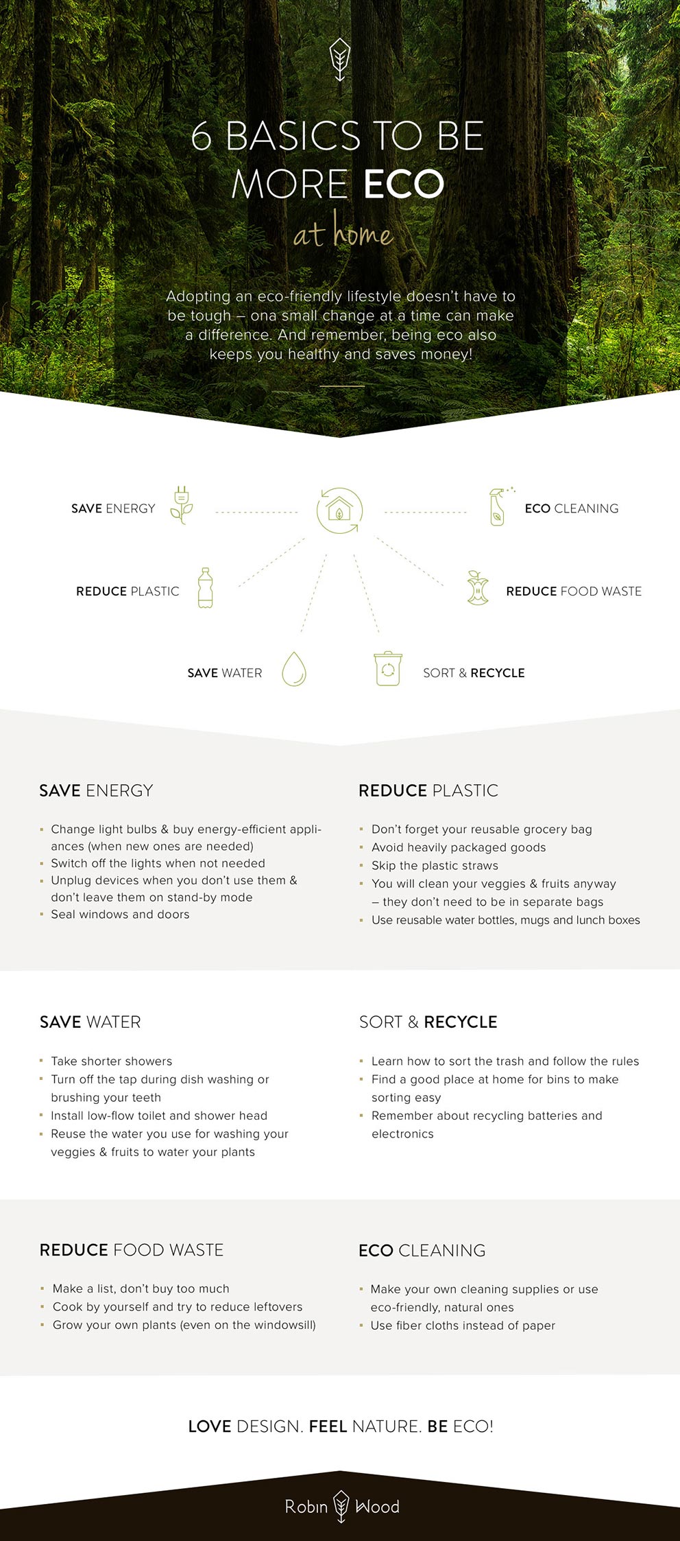
Another core element of the brand strategy is the messaging and language, divided into six parts, each addressing a specific aspect of how people perceive and relate to brands, as reflected in the levels of cognitivity in the brand pyramid:
- Philosophy: The brand’s philosophy is communicated, emphasizing the pleasure of wearing the products, the connection to nature, and the lifestyle associated with travel and various activities.
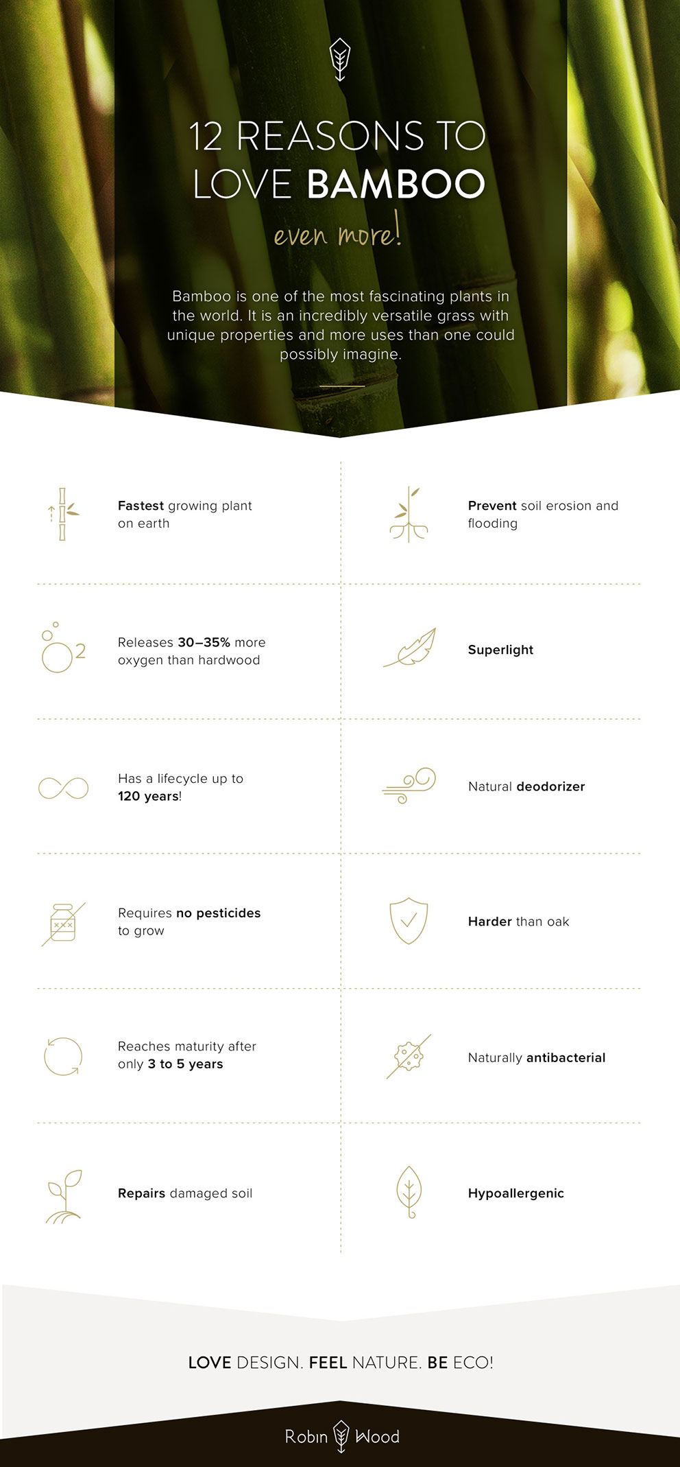
- Ecology: Dedication to the environment is demonstrated by highlighting the crops and materials used and the conscious decisions made to have a positive impact on the environment. Involvement in various ecological initiatives is showcased.
- Education: The aim is to educate the audience about ecology and the importance of being eco-conscious. Awareness is raised about consumer choices and a balanced lifestyle aligned with the brand’s values.
- Used materials: Detailed information is provided on the selection, cultivation, and processing of the materials used, highlighting their natural appearance and vegan nature.
- Product: The products are presented as a harmonious blend of art and ecology, showcasing minimalistic and stylish designs that are both fashionable and highly functional. Emphasis is placed on the exceptional quality of the handcrafted pieces, exuding individuality.
- Sales: Essential aspects such as pricing, warranty, returns, and the commitment to providing free shipping are covered. A „no promotions” policy is maintained, and exceptional customer service is prioritized.
LOVE DESIGN. FEEL NATURE. BE ECO.<
Visual identity
Selected elements
LOGO
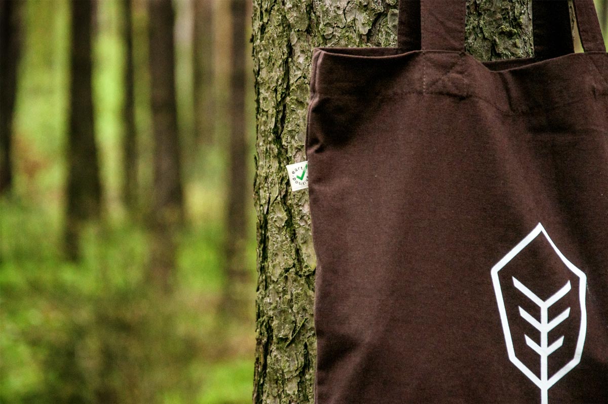
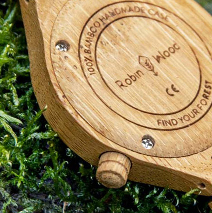
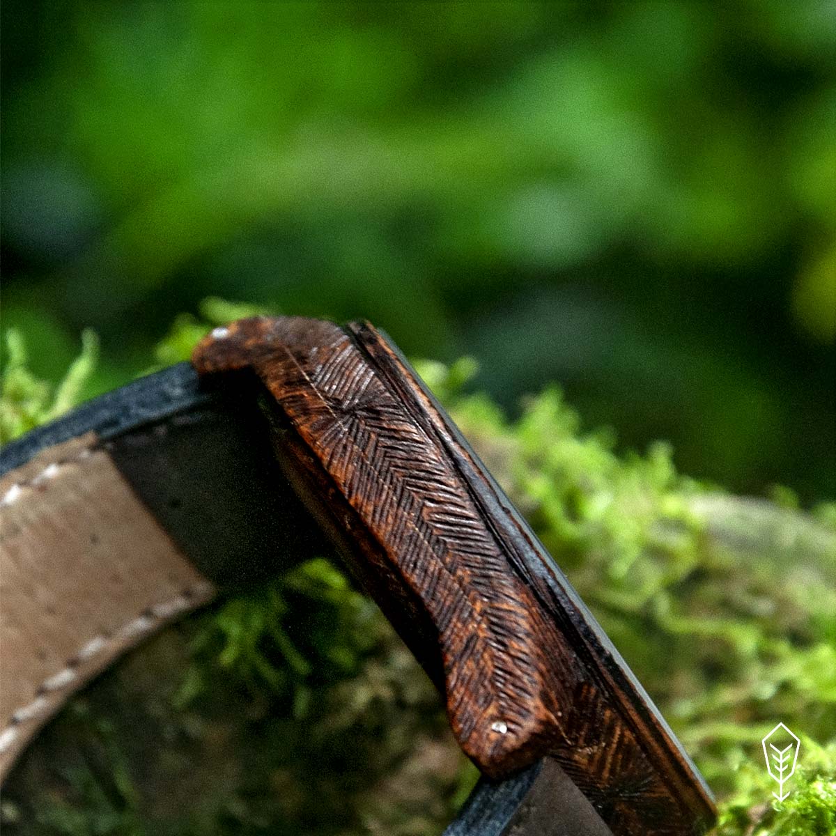
The design of the logotype and symbol was a very demanding process. The logo wasn’t only the symbol of Robin Wood’s world but had to be adaptable for numerous purposes, simultaneously. Elasticity was the key – the logo was designed to be imprinted on various materials, often using severe techniques: from laser burning on very small and delicate bamboo surfaces through pyrography machine tips and embroidery, to print and digital materials.
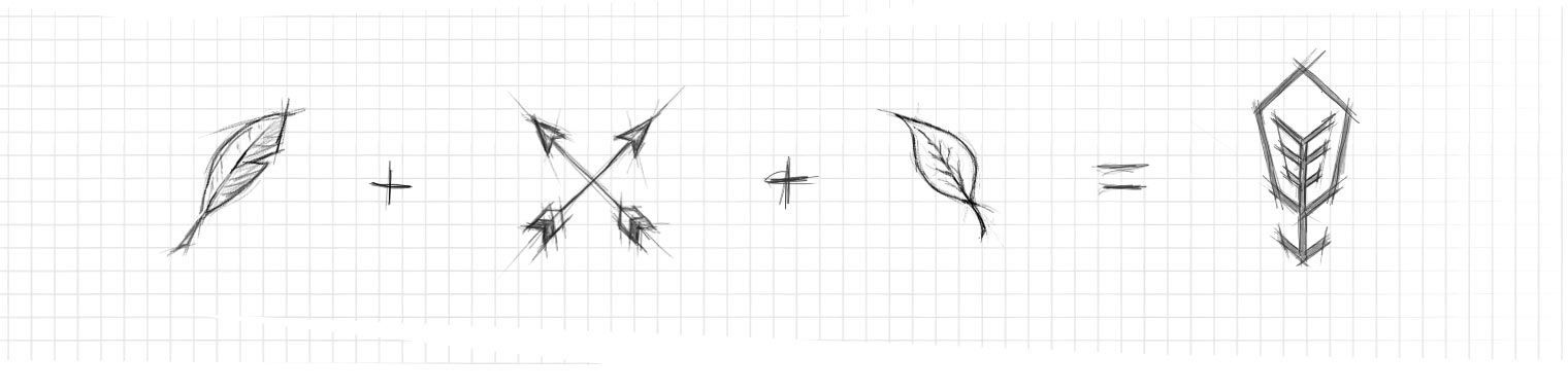
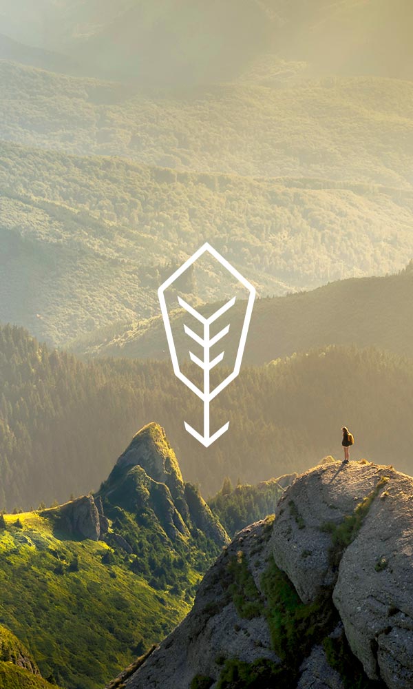
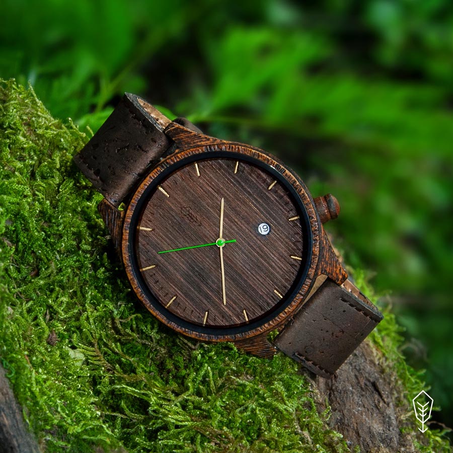
The story behind Robin Wood’s brand led to the creation of the symbol, as the combination of the famous feather in Robin Hood’s hat and his arrow, drawn in the shape of a leaf. The arrowhead is a metaphorical depiction of planting trees, which was the core pro-environmental activity that Robin Wood supports with each purchase of its products.
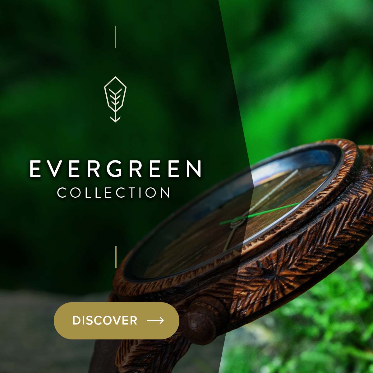
For the logotype, I designed a custom, minimalist font, balanced with delicate serifs inspired by sprouting plants. The additional line in the „W” is in reference to a simplified pine tree, the cherry on top of the metaphorical connection to nature.
Colour
The brand identity has been predominantly designed in and around the images of nature and forests. It allowed for the creation of the feeling of greenness and closeness to nature.
Choosing the right brand colours was essential to capture the essence of forests. While green was initially considered, it tended to create a monochromatic effect and lacked the desired element of distinction. Instead, a deep seal brown, inspired by the shade of horses’ coats and reflecting Robin Wood’s commitment to equine care, became the primary colour. Whether printed on craft paper or used on the website, this brown hue consistently provided excellent contrast and complemented photos in a natural manner. Additionally, the brown colour symbolizes wood and soil, further reinforcing the brand’s eco-friendly ethos.
For secondary elements, accents, and call-to-actions, a more distinctive colour was needed to draw attention while maintaining the overall aesthetic. After extensive testing in both print and web design, „gimblet” emerged as the perfect choice. This colour added freshness and dynamism to the visual identity, seamlessly complementing the brand’s overall look and feel.
Fonts
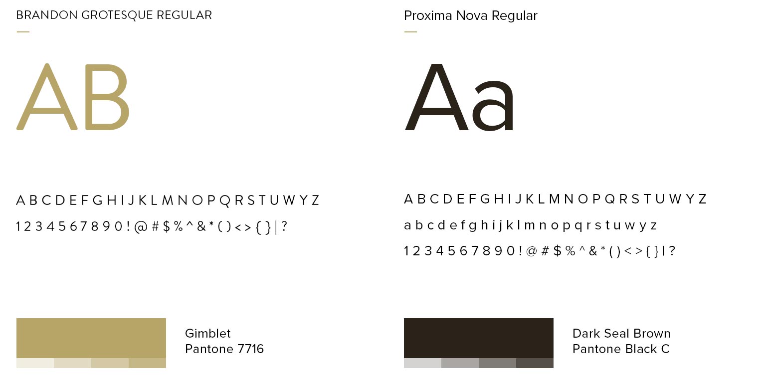
A large part of the beauty of a minimalistic design is created through font selection. The feeling, simplicity, readability and all parts of the letters’ anatomy play crucial roles for me during the process of designing or choosing the appropriate fonts. In the case of Robin Wood, it was clear, from the beginning that most projects would be imprinted on varying materials. Therefore, the variety of thicknesses of “Proxima Nova” was the ideal solution for a body text in all foreseen media. The distinctive style of “Brandon Grotesque” for headlines added more of a raw and natural feeling. The overall balance and lightness between both fonts interact beautifully with the other elements and imagery.

Iconography design
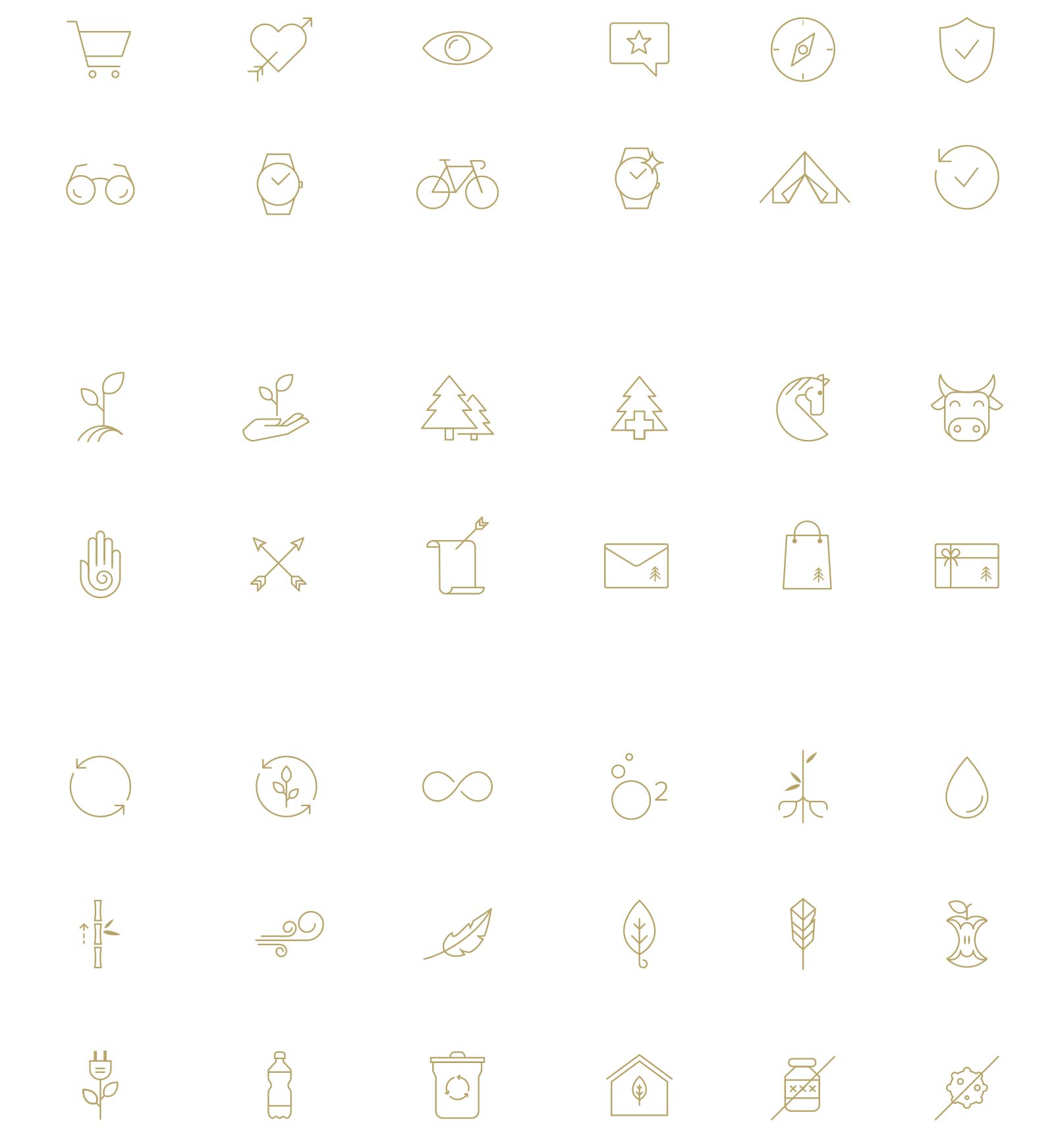
I built an entire layer of visual language based on icons to support the brand’s communication. Many companies use generic icons, thereby forfeiting their purpose. In minimalistic design, every element is essential and should bring value. Therefore, simple, but self-explanatory icons were an important part of Robin’s visual identity and became a distinctive element of the brand. I designed them carefully, each telling a short story, so as to make every line count.
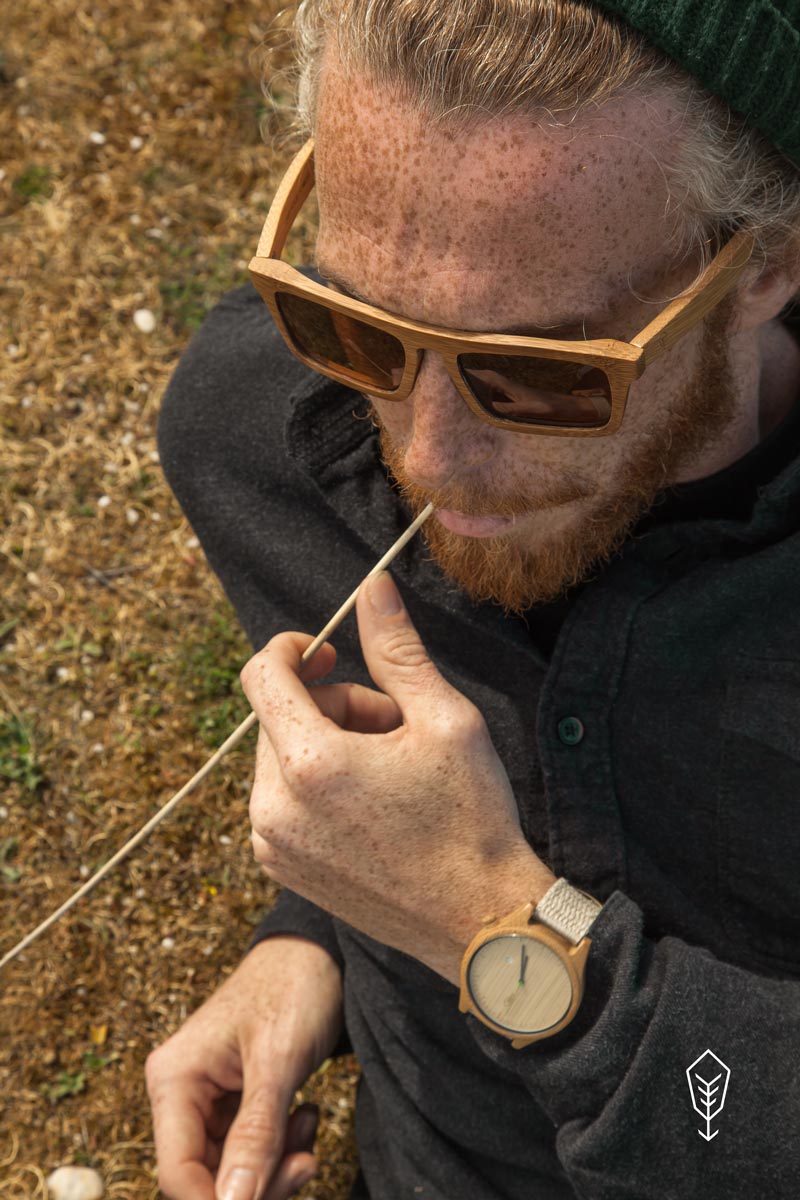
Photoshoots
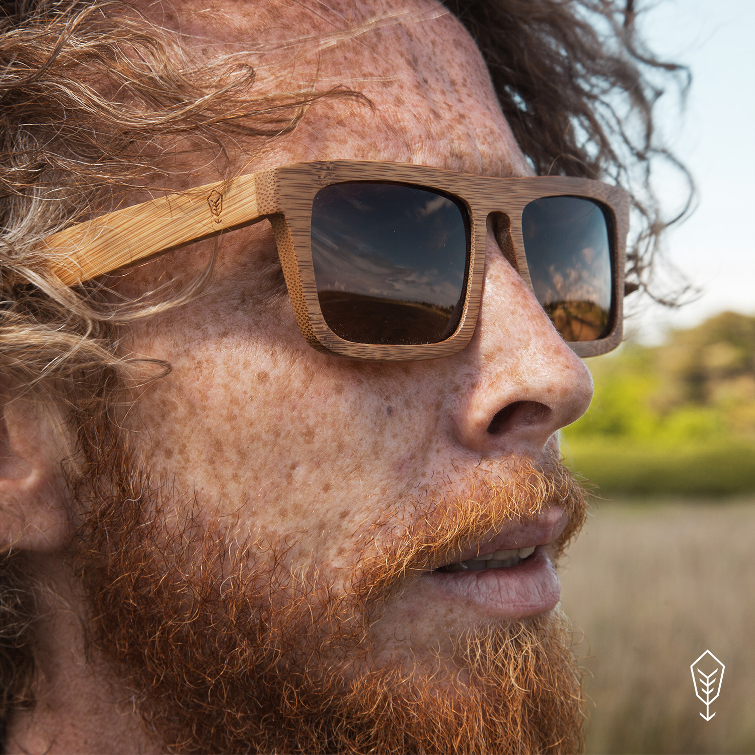
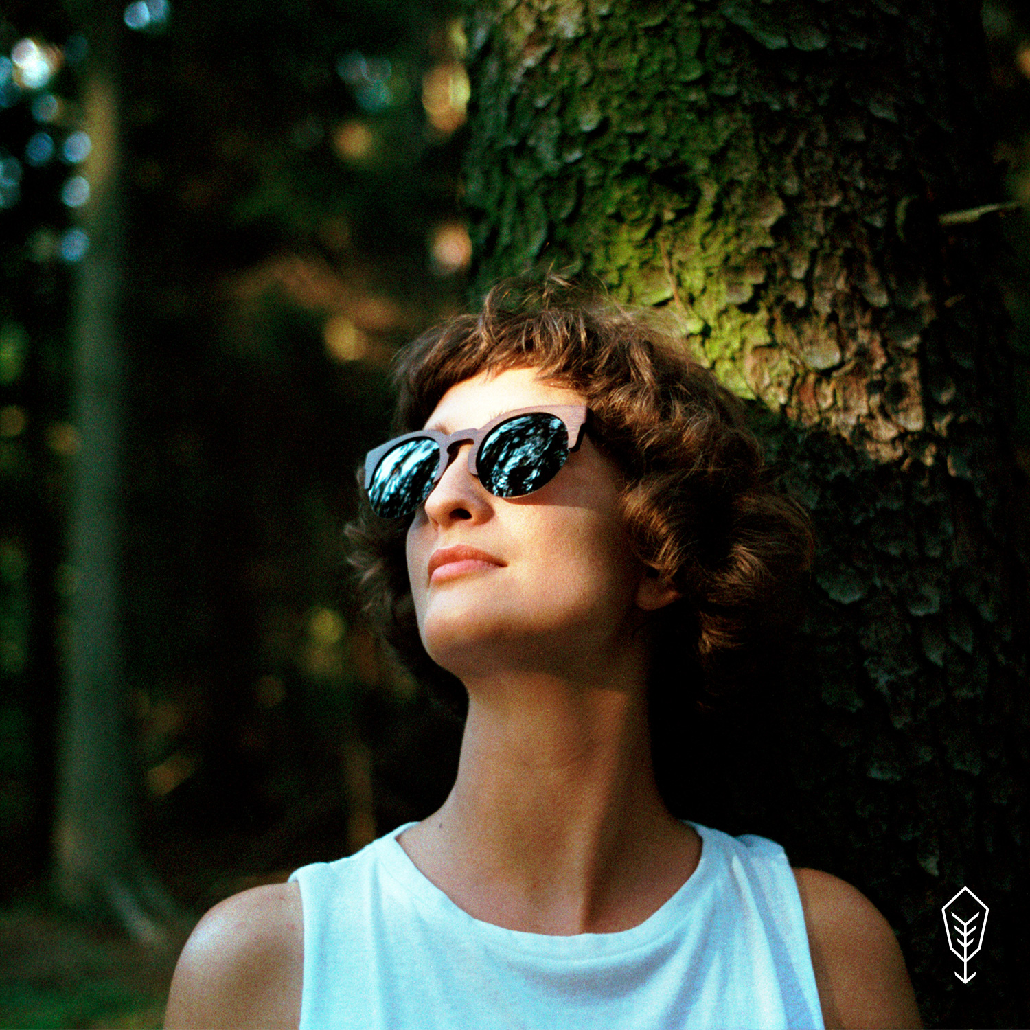
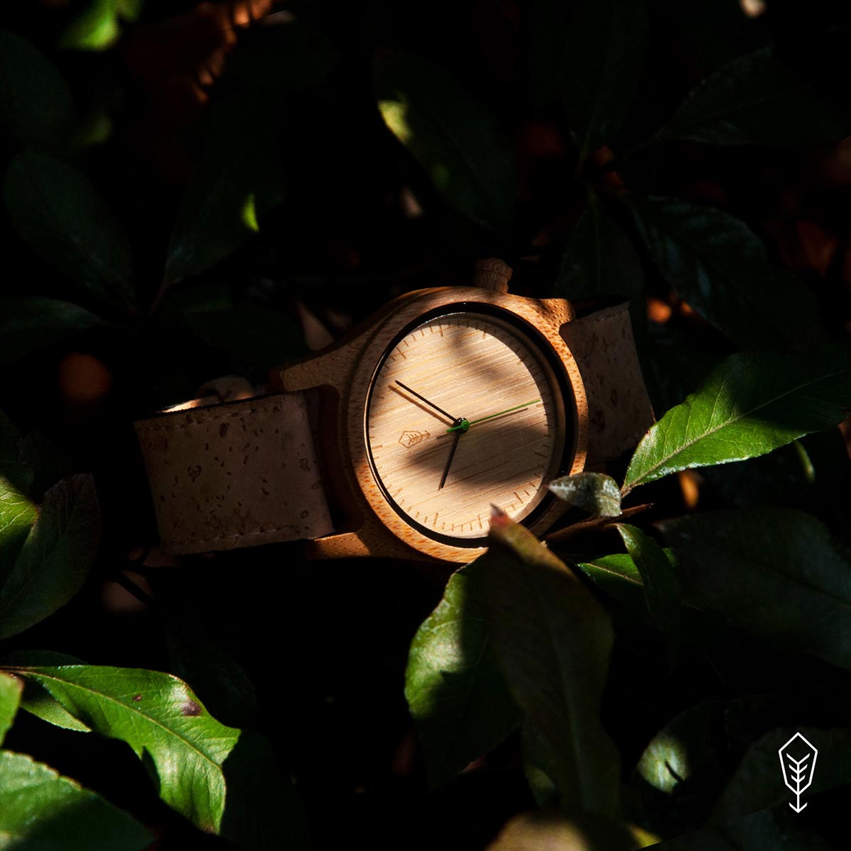
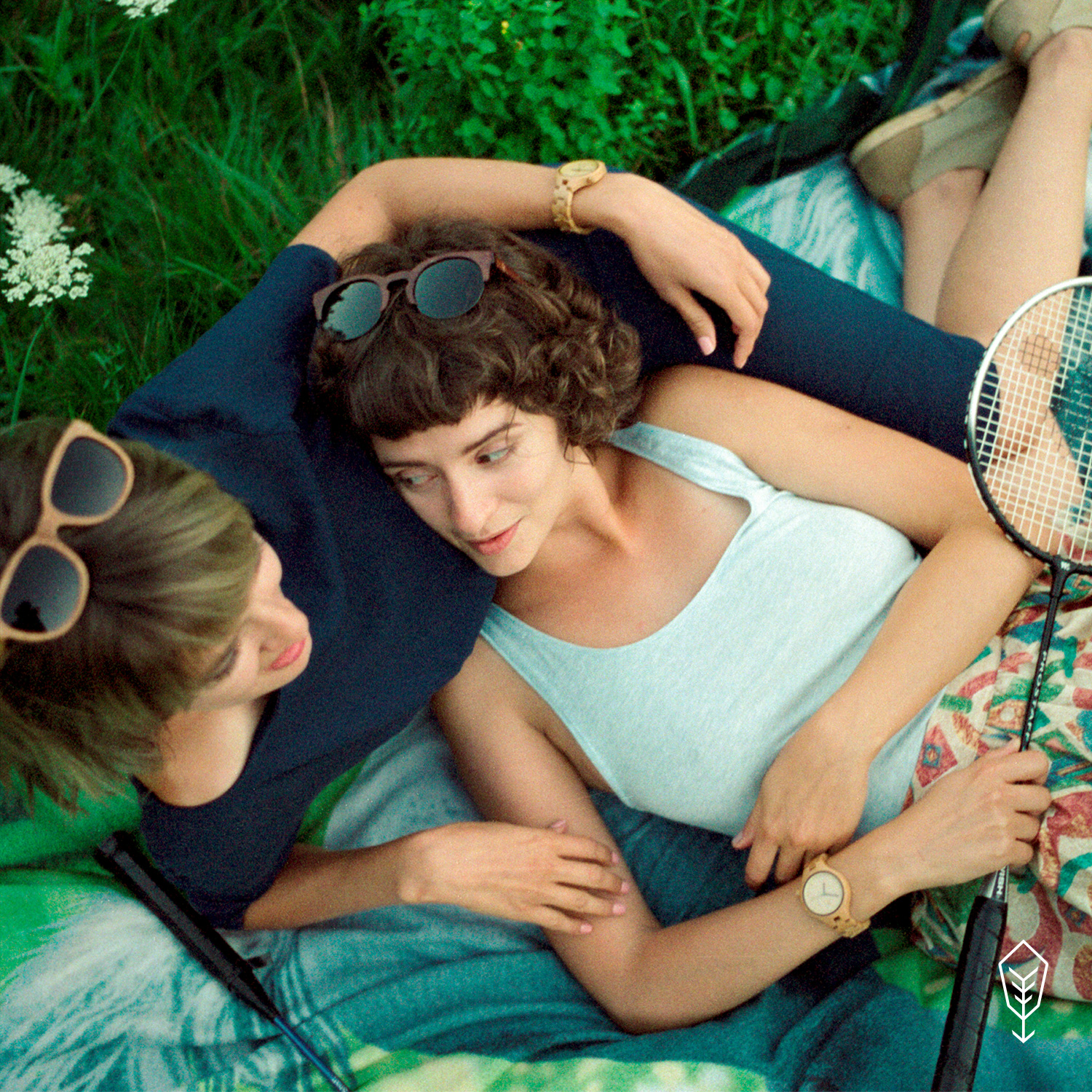
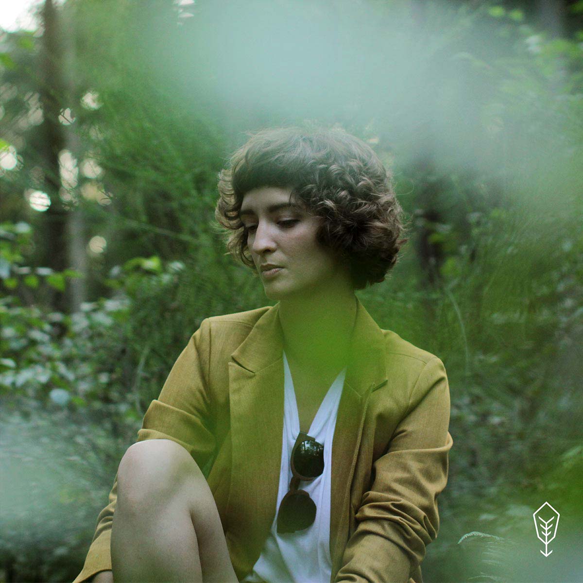
Product photos, with great attention to detail, had to be perfectly balanced with the feeling of closeness to nature. The reserved nature of the photos was crucial – it was always about bringing the right ambience and emotions. The visual invitation to the world of Robin Wood was a combination of lightness and naturalness. I created strict guidelines for product photography to keep the most important values in place and consistent with the entire world that was created. Art Directing the photoshoots, collaborations with models and photographers, experimenting with frames, light, materials and taking the majority of the photos myself, was not only an amazing experience, but more importantly, allowed me to develop each part of the brand to be as extraordinary and consistent as possible.
Product design & packaging
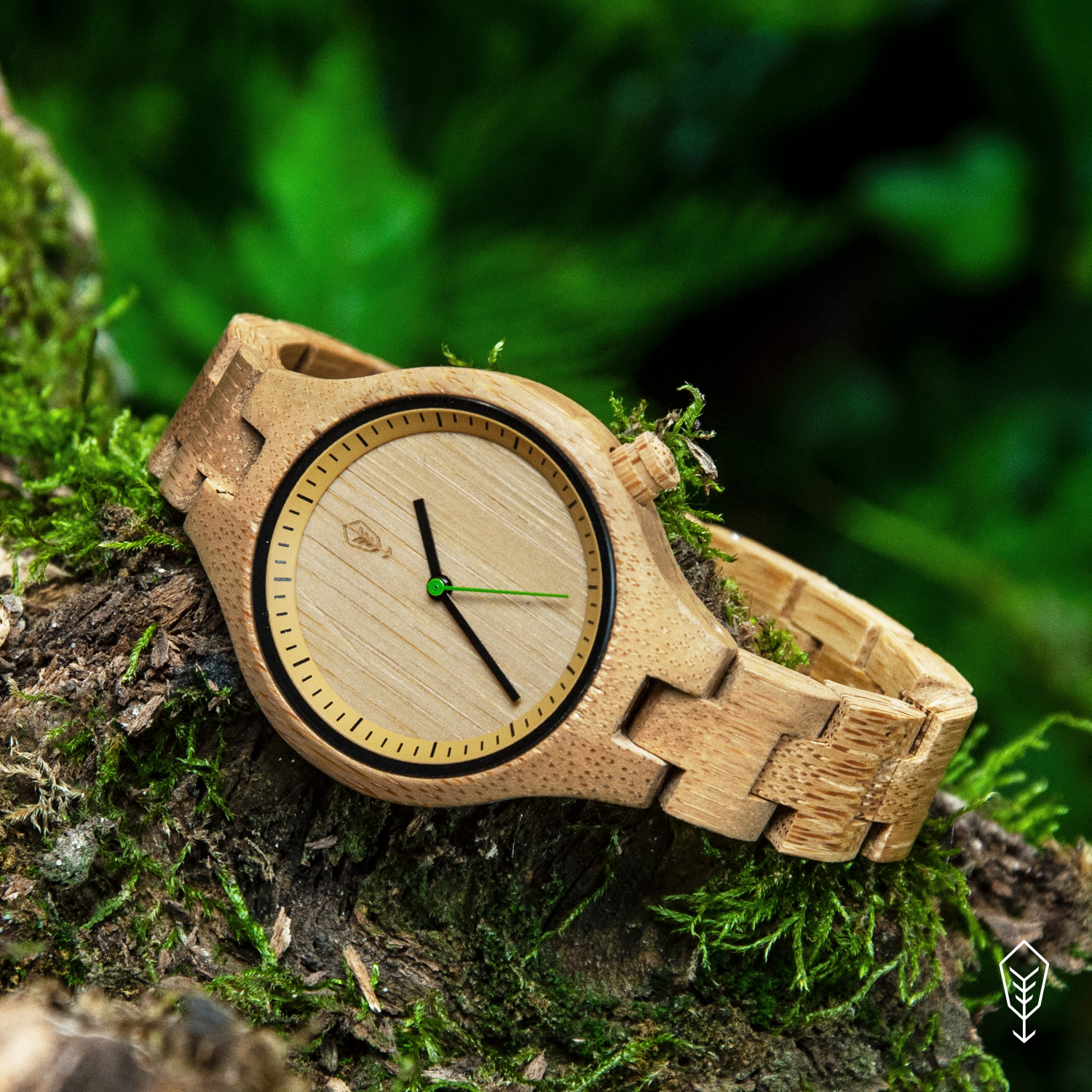
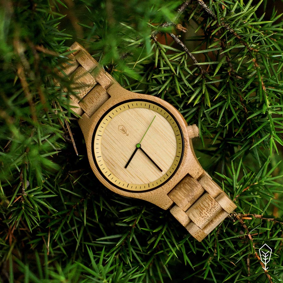
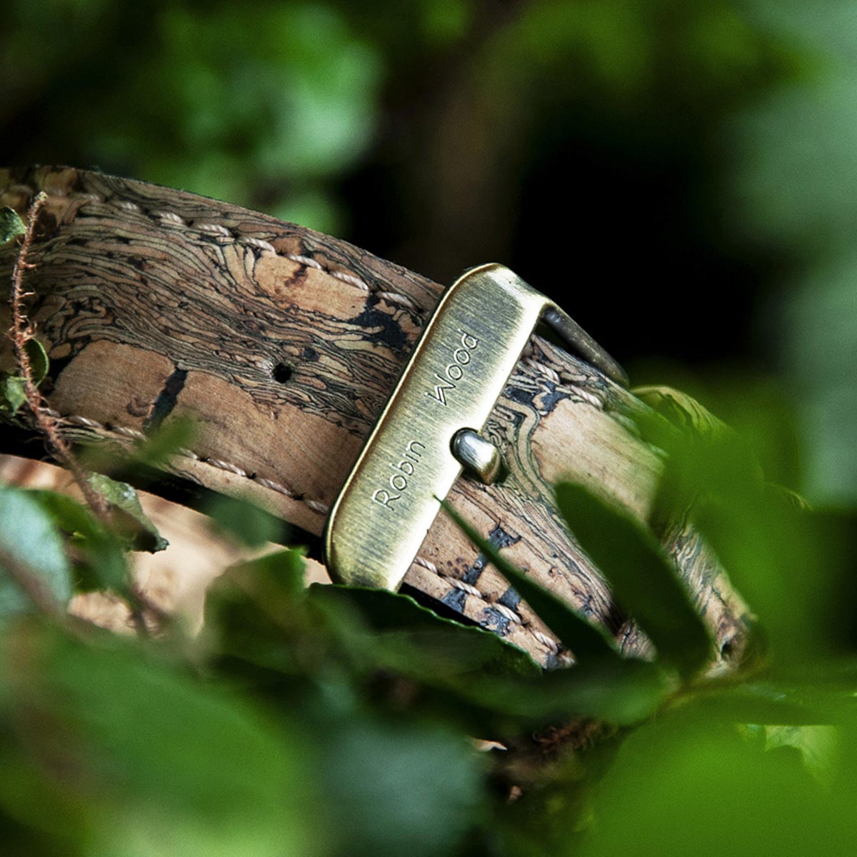
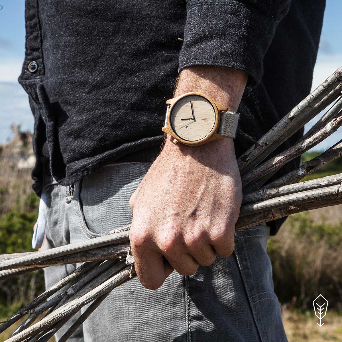
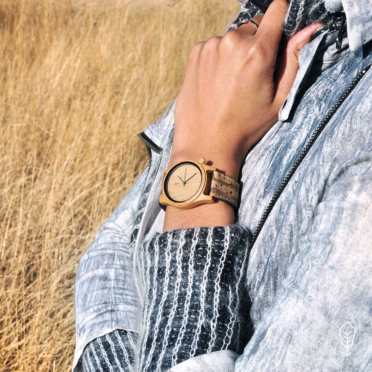
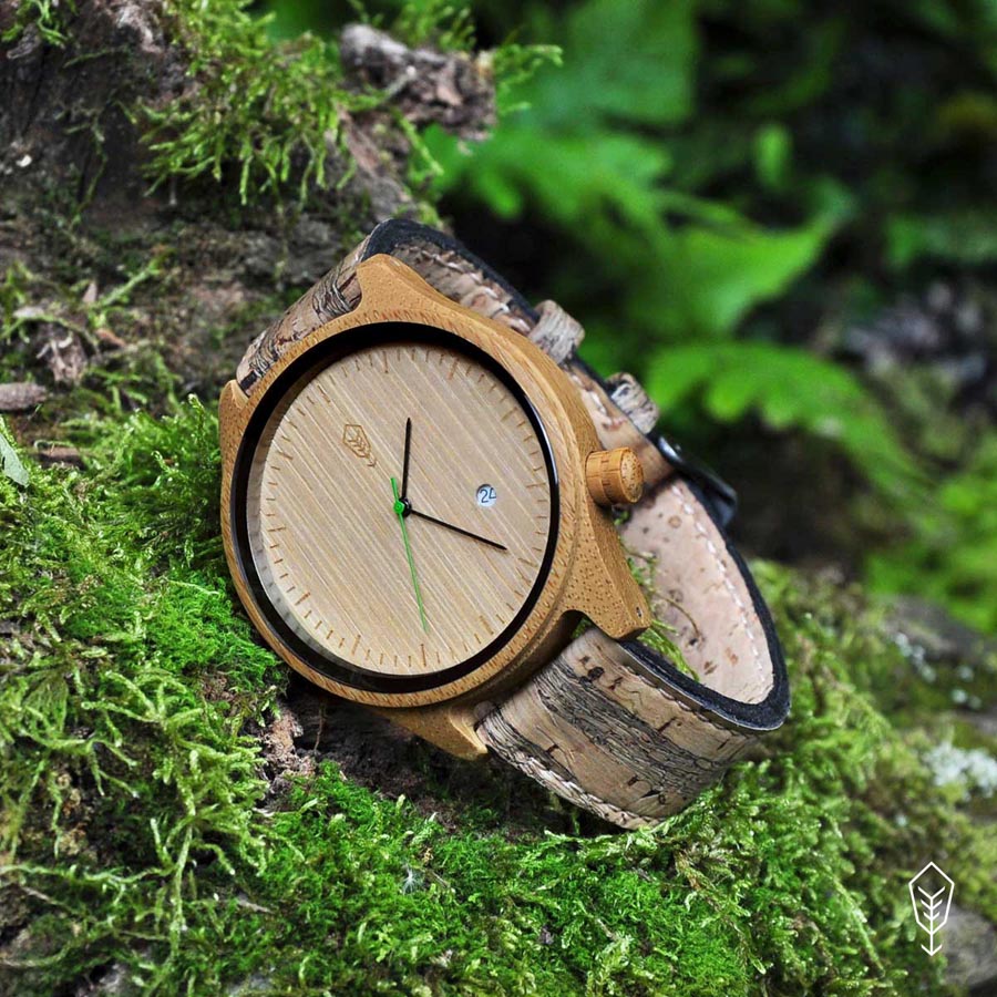
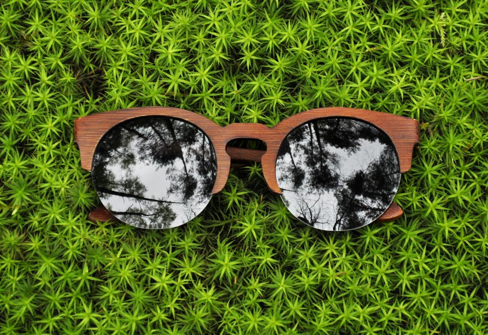
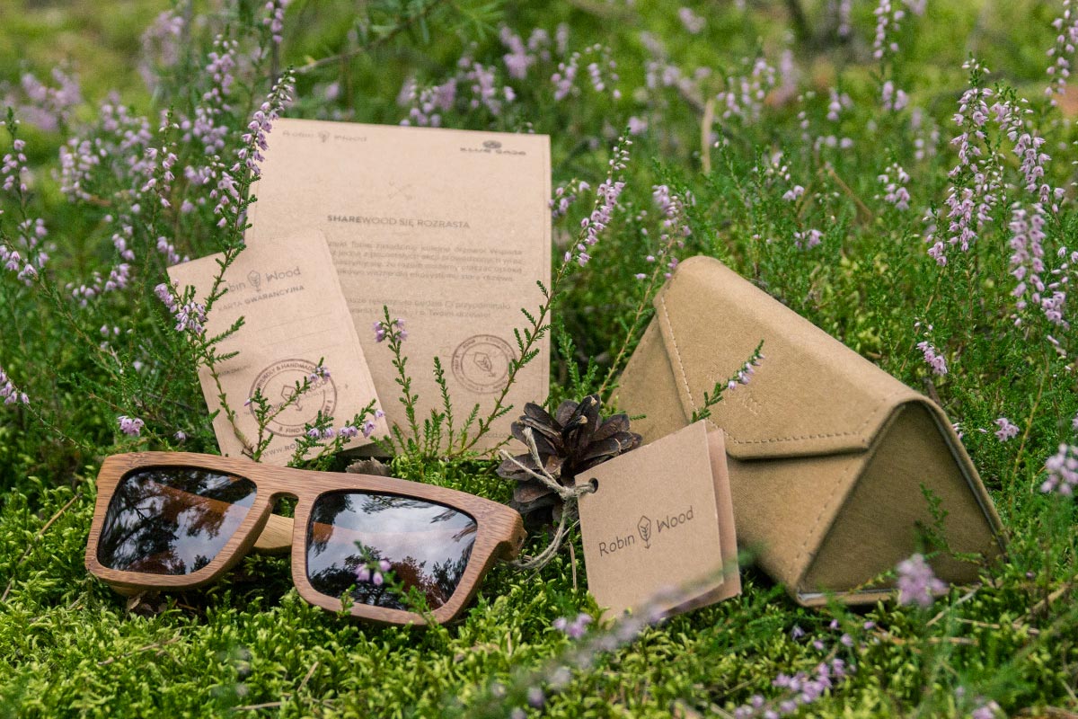
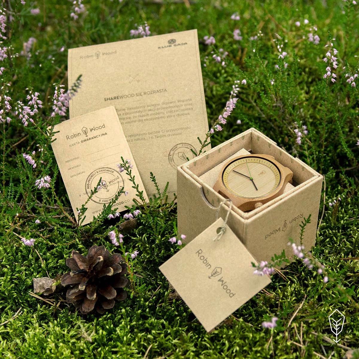
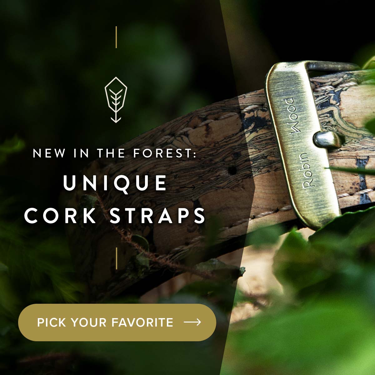
The minimalistic design of the products served as a background for what mattered the most – the natural materials. Because every piece of bamboo, cork and hemp were different – each time a pair of sunglasses or watch was handcrafted, it was certain that each piece would literally be unique. Natural textures gave an individual, unique character to every product which made them special and showed the real spirit of the Robin Wood brand.
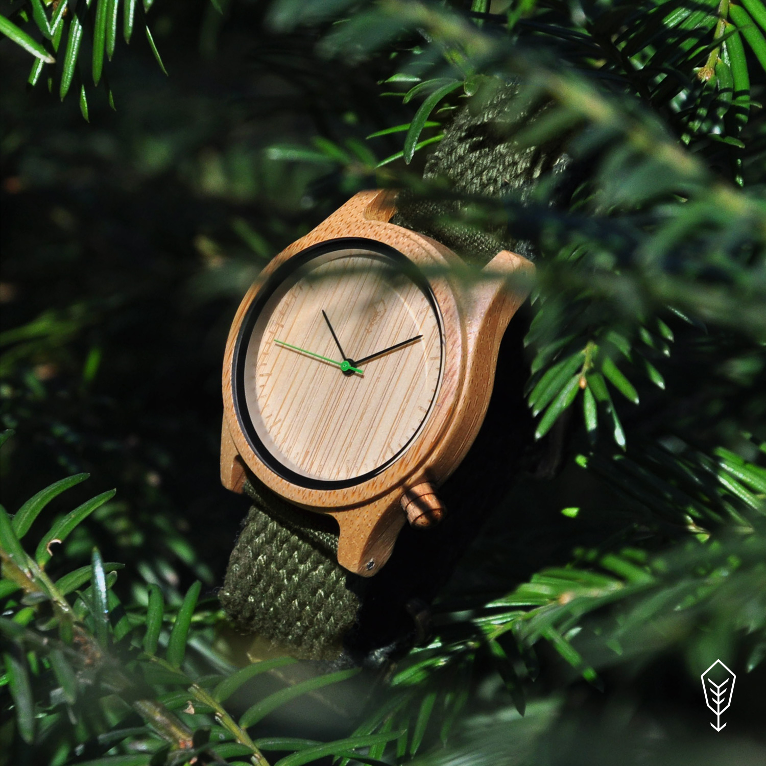
To further distinguish the design of the watches, I designed a green second hand and a slanted, bamboo crown, that quickly became recognizable elements of all Robin Wood watches.
The packaging and protective filling were made from recycled paper, stamps were use instead of prints and hemp cords, and each box contains a real pinecone, doused in patchouli and pine scents. The unboxing experience is just the beginning of the journey for our customers. Giving them a sense of closeness to the forest and nature as soon as the box is opened, was another vital part of the experience I created.
Marketing campaigns
The marketing materials for various campaigns featured a minimalist design based on fonts, lines, and lifestyle or nature photographs. Significant emphasis was placed on striking a balance between communication design, readability, and contrasts, while effectively utilizing the visual narrative potential carried by the photographs.
Content marketing
One of Robin’s Wood missions was to share knowledge in order to spread the idea of being eco. Part of the brand’s communication was content shared on social media, to raise awareness about different environmental issues.
Part of this strategy was also intended to overcome one of the biggest barriers that customers faced – the durability of the materials used. They wanted to be sure that products made from bamboo would last for longer, when compared to plastic and metal ones. The cornerstone of a trustworthy brand is content marketing built on valuable and verified information. The design then serves as a method of conveying the message in the most efficient and appealing way.